

How to: Find a top app designer
Finding the right app designer is a process that should never be taken lightly – there are so many app development companies out there, and each has their own approach to app design. So how are you supposed to know what to look for? How do you cut through all the chaff? How do you find your top app designer?
The only fool-proof method for discerning what makes good design is to know it yourself – so, before we go over how to find a top app designer, let’s look into what makes a well-designed app.
For a general guide to finding a mobile app developer, visit our blog on the topic: How to find the perfect mobile app developer.
Knowing is half the battle
There’s a quote I’d like to put here before we get any further:
“Form follows function – that has been misunderstood. Form and function should be one, joined in a spiritual union.”
It’s a quote from probably the most famous architect in modern history, Frank Lloyd Wright – and a re-framing of his mentor’s original words: “Form follows function.” What Wright wanted to impart to other designers was that (at least in contemporary terminology) good user experience and good design are one in the same, and go inescapably go hand-in-hand.
Users are named as such because they use apps to accomplish something; just as important as the why of an app, is the how it goes about accomplishing said task. That “how” is where good design lives.
In order to know how you want your app to look, feel, and act, you first need to know why it will do the things it does.
Discovering your pain point
Every app helps play a part in the solution to a pain point. Whether it’s a consumer-facing productivity app, a mobile game, or an enterprise level app, they’re all meant to help solve a problem their audience faces throughout their day, week, or lives.
There’s three main ways you can go about discovering your app’s pain point – through identifying a pain point in your own life, from conducting market research into a particular market or audience, or from identifying key areas of your business operations to improve upon.
No matter the origin of your pain point, the most crucial aspect to determining your app’s success is to make sure your app will help solve a problem that’s worth solving. When it comes to app pain point ideation, I like to think of another quote – this one from my poetry professor in college: “Write about grief. Not a grievance.”
Now, we’re not writing poetry here, but it cuts to the core of the idea – a pain point is, by definition, painful. For an app to fall into the realm of truly valuable, the pain point it solves must be worthy of its namesake.
What makes a good pain point?
Not all problems are made equal. Some pain points just aren’t all that painful, and some don’t fit well in a digital medium. Let’s go over the four determining factors for judging the quality of your app’s pain point:
Frequency
While these factors aren’t listed in any particular order, this facet may be the most important. All apps on both The App Store and Google Play are ranked by a few different metrics – of which user retention plays a significant role in determining their ranking.
User retention is the frequency at which users engage with your app – and different types of apps can expect different engagement rates. A customer-facing app that updates users on their electrical usage might be checked once a week, or once every month. A fitness app can be expected to be opened at least a few times a week, and apps like mobile games can sometimes expect engagement rates of multiple sessions per day.
Mobile games high engagement rate is due to providing a solution to the number one pain point of all time: boredom. Because of this, mobile games do often see high retention numbers in the short term – they do, however, struggle to maintain that retention over time. As users become more familiar with a game, the pull of a new experience diminishes – and eventually, leads to the pain point the game was originally intending to solve.
When determining the feasibility of an app, always keep the expected user engagement frequency in mind – it will help you plan your push notification campaigns.
This can be especially important for apps that are centered around once-a-year timings, like a Black Friday bargain app. This app would want to start its push notification campaign the day after Halloween, and ramp up until Thanksgiving evening. In order to be successful, a Black Friday app would need to maximize its user engagement throughout all of November.
Context
There’s a rule I named myself – I call it the “subway-cornfield” rule. Basically, it means your app should behave the same no matter where a user is engaging with it – whether they’re standing in a subway, or the middle of a cornfield.
When designing your app, however, it’s main use case should be carefully considered – while it should work well in all situations, it should excel in a select few. For instance, compare the UI of Google Maps to that of Facebook:
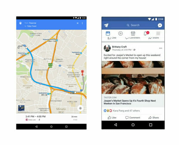
While there’s only a few buttons and fields to interact with through Google Maps, Facebook’s UI has a substantial number of options from which to select. Why is this?
I don’t know about you, but when I’m interacting with Google Maps, I’m usually already in my car, moving, and need to keep my eyes on the road. A user on the move is Google Maps’ main use case – so in order to provide the best experience, the UI was designed to be as simple as possible. With a simple UI, the solution to the pain point of being lost is solved faster – which keeps users’ eyes on the road, and not on there phones.
This provides the user (and those around them) with a better (and safer) user experience.
*NS804 in no way condones using your phone while driving*
Also note how information is presented in Google Maps – important roads are highlighted with a strict hierarchy: blue for the route the user is taking, orange for highways and interstates, yellow for main thoroughfares, and white for side streets.
From a zoomed-out perspective, only major landmarks, parks, neighborhoods, roads, and businesses are named – as you zoom-in, names auto-populate as visual space becomes available.
All of these design choices are both intentional, and important to Google Maps’ UX. When less information is presented to a user on a single screen, they’re able to more quickly take in the information they actually need.
Facebook’s mobile app takes the direct opposite approach – users are given lots of options and information (both visual and written) to consume. Facebook’s main mobile use case is someone who is both bored, and has the time to engage with the app. Due to this, Facebook is designed to keep users scrolling for much longer periods of time than a user would spend with Google Maps.
Marketability
There’s a cold hard truth every app has to face: you have to make money somehow. There’s another quote I’d like to share, this one from Mark Fischbach: “If the app is free, you’re the product.”
This doesn’t necessarily mean every free app is collecting and selling your personal data (here’s to you, Facebook), but free apps more often than not do have some form of monetization that revolves around an entity purchasing user’s time or views. Advertisers purchase space on a free app in order to capture the attention of users – just as platforms will offer free versions of an app in order to entice users to purchase the premium version.
Here’s a list of a few app monetization models:
- Paid download
- Subscription fee
- Ads
- Take a percentage of sales
No matter what, your app must provide a good enough solution to its pain point for people to be willing to spend money on it. Keep in mind what monetization model your app will implement – it will help you streamline your design and development schedule.
Longevity
Remember the mobile gaming example? App longevity is a key factor in determining if a pain point is worth it.
If an app solves a once-in-a-lifetime, or even a once-every-five-years pain point, it probably doesn’t need to be an app. There is one exception, however – a use case that isn’t reoccurring for the individual, but is widely spread throughout the population as a whole. Or, put simply – something that you might only deal with every few years, but at least a few people deal with every day.
Here’s an example; you don’t paint your house every day. You don’t, however, see a lack of painting companies – both suppliers and actual painters. Just because a single family only repaints there house every five years, or even once a decade, there’s always a few houses with a fresh coat of paint.
An AR app that allows users to play with the color of their walls when selecting what color paint they want to purchase may only be used once by that individual; but as a wide-spread pain point with a straightforward and easy solution, it will continue to be used by other users in other houses the next day.
There’s a lot more to proper app design – we just wanted to give you an introduction to the thought process behind good UI/UX, and what ultimately lays the groundwork for a well-designed app. We’ll be getting deeper into the subject in the future.
For now, let’s get to the actual finding part. First thing’s first…
Don’t use Google to find designers
There are already companies dedicated to finding designers for you. Two sources you can trust are Clutch and The Manifest. There are a lot of sites out there that showcase app design companies – but these two you can trust, as they use information from a designer’s client history, client reviews, as well as ability to deliver in order to determine rankings, rather than a payment hierarchy method.
Using Clutch
Clutch gives you the ability to find app design companies, set what parameters you want to use to find them (by platform, vertical, or location), and provides you with a breakdown of that designer – from client reviews to service lines, and from industry focus to what types of business they’ve worked with in the past.
Clutch also hosts a blog where you can find information covering everything from B2B marketing to ASO and beyond.
A nice feature Clutch offers are badges, which developers can display on their site to show that they’re trustworthy. If you see a developer with a Clutch badge, they mean business, and you can rest assured they know what they’re doing.
Using The Manifest
The Manifest operates in largely the same manner as Clutch. The Manifest offers industry leader shortlists, and a blog hosting great thought pieces and business advice.
Like Clutch, The Manifest will offer a short bio and client history for each development firm, so you can get a feel for what each developer brings to the table.
And with that…
You’re all set! Happy hunting!
Just remember that you’re always going to have questions – and that’s okay. A good designer will either have an answer for you, or do what they can to find one. Most importantly, your personal preference and business needs should always be taken into account, and if a website is telling you x is the better choice, but you have a good feeling about y, go with your gut.


Leave a Reply
Want to join the discussion?Feel free to contribute!