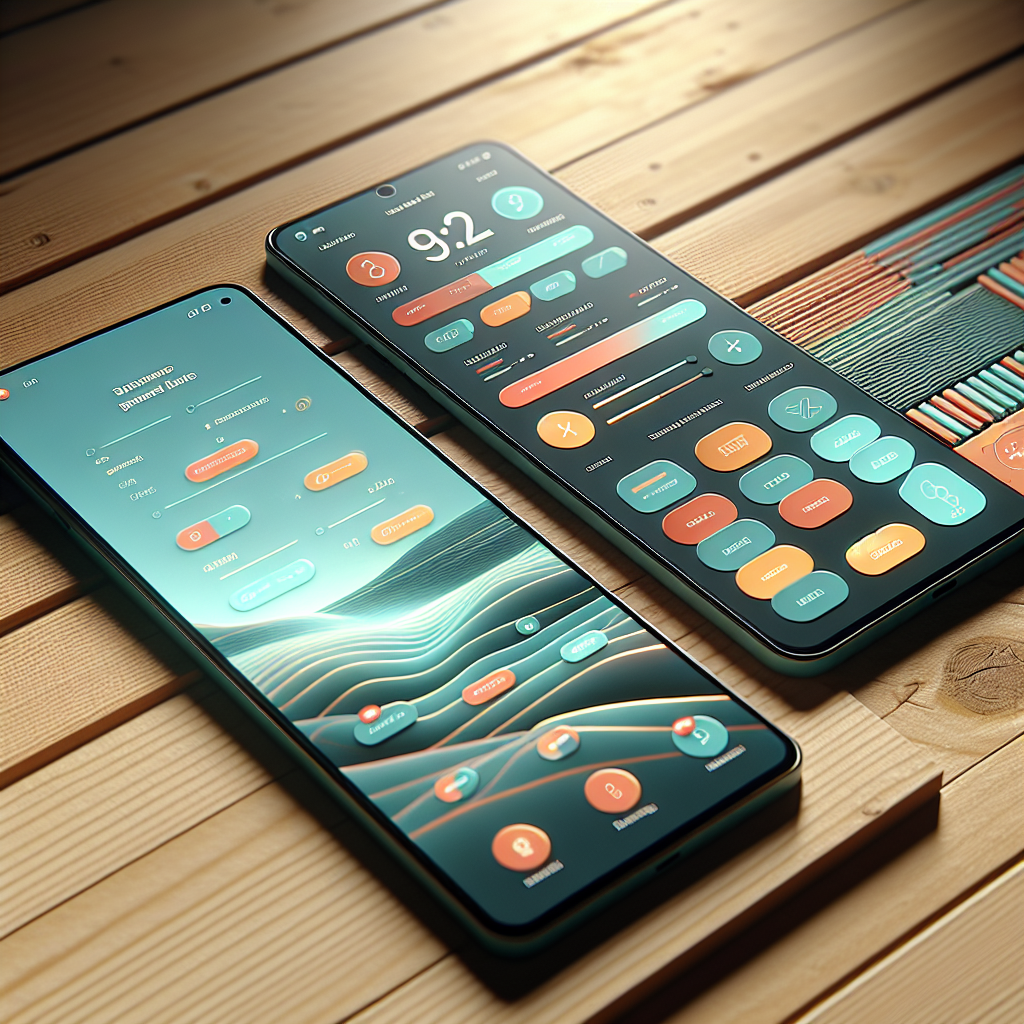
How to Design a UI for Your Android App Like a Pro!
In the digital landscape, the user interface (UI) design of your Android app plays a crucial role in determining its success. A well-crafted UI not only attracts users but also enhances their overall experience, leading to increased engagement and retention. Understanding the importance of UI design is essential for any developer or entrepreneur looking to create a standout application.
Here are some key reasons why UI design should be a top priority:
- First Impressions Matter: Users often form opinions about an app within seconds. A visually appealing and intuitive UI can captivate users right away, encouraging them to explore further.
- Enhances Usability: A well-designed interface ensures that users can navigate through the app easily, reducing frustration and increasing satisfaction. This is vital for keeping users engaged and coming back.
- Brand Identity: Consistent UI design reflects your brand’s identity and values. It helps establish trust and loyalty among users, making them more likely to recommend your app to others.
- Competitive Advantage: In a saturated market, having a unique and user-friendly UI can set your app apart from competitors, making it more appealing to potential users.
To effectively attract and retain users, it is essential to invest time and resources into designing a UI that resonates with your target audience. Get a free quote for your mobile app development project today and elevate your app’s design to professional standards!
Key Principles for Designing Android App UIs

Designing an effective user interface for your Android app requires a deep understanding of several key principles that guide the development process. These principles not only enhance the aesthetic appeal of the app but also improve usability, ensuring that users have a satisfying experience. Here are some fundamental principles to consider:
- Consistency: Maintaining a consistent design across all screens fosters familiarity and ease of use. This includes using similar colors, fonts, and button styles to create a cohesive look and feel.
- Hierarchy: Establishing a clear visual hierarchy helps users understand the importance of different elements within the app. Use size, color, and spacing to draw attention to key features and functions.
- Feedback: Providing immediate feedback for user actions, such as button presses or form submissions, helps users understand the results of their interactions. This can be achieved through animations, color changes, or notifications.
- Simplicity: A clutter-free interface enhances usability. Aim to minimize distractions by focusing on essential elements and providing intuitive navigation paths. This allows users to complete tasks efficiently.
- Accessibility: Designing with accessibility in mind ensures that your app can be used by everyone, including those with disabilities. Consider using larger text sizes, high-contrast colors, and alternative text for images.
By adhering to these principles, you can create an Android app UI that not only looks great but also provides a seamless experience for users. Prioritizing these aspects during the design process will ultimately lead to higher user satisfaction and retention rates.
Utilizing Android Design Guidelines Effectively

When it comes to developing a successful Android app, leveraging the Android Design Guidelines is crucial. These guidelines, provided by Google, offer a comprehensive framework for creating intuitive and user-friendly interfaces. Here’s how to utilize these guidelines effectively:
- Understand Material Design: Material Design is a foundational concept in Android app development, emphasizing the use of grid-based layouts, responsive animations, and depth effects like lighting and shadows. Familiarize yourself with these concepts to ensure your app feels modern and cohesive.
- Follow Typography Recommendations: Typography plays a significant role in readability and user experience. The guidelines suggest specific font sizes, weights, and styles that enhance legibility across various devices. Ensure you apply these recommendations to create a clear visual hierarchy.
- Design for Different Screen Sizes: Android devices come in various shapes and sizes. The guidelines encourage developers to design flexible layouts that adapt to different screen dimensions. Use responsive design techniques to ensure your app looks great on both large tablets and small smartphones.
- Incorporate Touch Feedback: Touch interactions are central to mobile app usability. The guidelines recommend providing visual feedback when users interact with UI elements, like buttons and switches. This feedback can come in the form of color changes, animations, or sound cues.
- Utilize Component Libraries: Android provides a rich set of UI components that adhere to these guidelines. By utilizing these pre-built components, you can save time and ensure that your app maintains a consistent look and feel while adhering to best practices.
By effectively applying the Android Design Guidelines, you can create an app that not only meets user expectations but also stands out in a crowded marketplace. Understanding and implementing these guidelines will help you design intuitive interfaces that enhance user engagement and satisfaction.
Creating Intuitive Navigation for Your App

Effective navigation is a cornerstone of a successful Android app. Users should be able to find what they need quickly and effortlessly. Here are some strategies for creating intuitive navigation that enhances user experience:
- Simplify the Menu Structure: A cluttered menu can overwhelm users. Aim for a clean and straightforward menu structure with a limited number of options. Prioritize the most important features and group related items together to help users navigate easily.
- Use Familiar Patterns: Users are accustomed to certain navigation patterns. Stick to established conventions, such as bottom navigation bars, hamburger menus, or tabbed navigation. This familiarity reduces the learning curve and makes your app more user-friendly.
- Implement Clear Labels: Ensure that the labels for your navigation items are clear and descriptive. Avoid jargon or overly technical terms that may confuse users. Opt for simple language that communicates the purpose of each option effectively.
- Provide Visual Cues: Integrate visual cues, such as icons and color changes, to guide users through the navigation process. Highlight the currently selected option to provide context and reinforce the user’s position within the app.
- Offer Back Navigation: Always provide a way for users to return to the previous screen. This can be achieved through back buttons, gestures, or breadcrumb trails. Ensuring easy back navigation enhances user control and reduces frustration.
By focusing on these principles, you can create a navigation system that is not only intuitive but also supports a seamless user experience. Remember, the goal is to make information accessible and interactions straightforward, allowing users to engage with your app effortlessly.
Choosing the Right Color Schemes and Typography

The choice of color schemes and typography plays a vital role in the overall aesthetics and usability of your Android app. These elements not only contribute to the visual appeal but also impact user emotions and interactions. Here are key considerations for choosing the right color schemes and typography:
- Understand Color Psychology: Colors evoke emotions and can influence user behavior. For instance, blue often conveys trust and reliability, while red can create urgency. Select colors that align with your brand identity and the emotions you wish to elicit from users.
- Create Contrast: Ensure that there is sufficient contrast between text and background colors. This enhances readability and makes the content accessible to all users, including those with visual impairments. Tools like contrast checkers can help you gauge whether your color choices meet accessibility standards.
- Maintain Consistency: Consistency in color usage helps in building a cohesive brand image. Stick to a color palette of 3-5 primary colors throughout your app. This not only reinforces your branding but also aids in navigation by allowing users to easily identify interactive elements.
- Select Readable Fonts: Typography significantly affects user experience. Choose fonts that are easy to read on mobile devices. Sans-serif fonts are generally preferred for digital content due to their clean lines. Avoid using too many different font styles, as this can create visual clutter.
- Hierarchy and Size: Establish a clear hierarchy in your text by varying font sizes and weights. Use larger, bolder fonts for headings and smaller sizes for body text. This helps users scan your content more effectively and understand the structure of the information presented.
By thoughtfully selecting color schemes and typography, you can create a visually appealing app that enhances user engagement and satisfaction. Remember, the right combination can significantly elevate the user experience and help your app stand out in a crowded marketplace.
Testing and Iterating Your UI for Optimal Performance
Once you have designed your Android app’s user interface, the next crucial step is testing and iterating your UI for optimal performance. This phase ensures that your app not only looks great but also functions seamlessly and meets user expectations. Here are some essential practices for effective UI testing:
- Conduct Usability Testing: Gather a group of target users to interact with your app. Observe how they navigate through the interface and take note of any pain points or confusion. Their feedback is invaluable for making necessary adjustments to improve usability.
- Utilize A/B Testing: A/B testing allows you to compare two versions of your UI to determine which performs better. By making small changes to elements like button colors or layouts, you can analyze user engagement and preferences, helping you make informed design decisions.
- Monitor Performance Metrics: Use analytics tools to track user interactions and behaviors within your app. Metrics such as bounce rates, session duration, and user retention rates can provide insights into how well your UI is performing and where improvements are needed.
- Iterate Based on Feedback: Design is an ongoing process. Use the insights gained from testing to refine your UI. Implement changes, test again, and continue to iterate until your app meets the highest standards of usability and satisfaction.
- Test Across Devices: Given the variety of Android devices available, it’s essential to test your app on multiple screen sizes and resolutions. This ensures that your UI maintains its integrity and functionality across different devices, providing a consistent user experience.
By committing to a rigorous testing and iteration process, you can enhance the overall performance of your app and ensure that it meets the needs of your users. Get a free quote to discuss how NS804 can assist you in developing and refining your Android app to achieve optimal results.


Leave a Reply
Want to join the discussion?Feel free to contribute!