
Top app design practices – 2019
Every year, mobile design evolves – and so far, 2019 has been big on embracing change. From foldable smartphones and rumors of those that even roll-up, to voice truly making an impact on the IoT.
There’s a lot to keep track of and look out for, with such a rapidly changing digital landscape and app marketplace. From 2015 and up until mid-2018, while devices were advancing, there weren’t too many drastic changes to processing speed and power, display clarity, or network speeds.
2019, has, so far, been the break in that static chain – and we’re only just in the second half of the year.
With faster data transfer speeds, sharper images, and a continued growth in our collective understanding of designing good UI (remember when we thought of UI as menus on a page?) for a medium that’s just now seeing people reach the 20 year mark, it’s imperative to keep up with such a trend-setting year for design.
We covered five mobile design ideas recently, but we wanted to go over even more – mobile app design is a large box to un-package.
Bottom Navigation
Think of how you hold your phone. Usually, it’s held in your dominant hand, using your thumb to scroll through and select content – it’s the overall preferred way we interact with our phones.
Since the beginning of mobile app design, there’s been a trend to position navigation bars at the top of the screen (not all apps, but a significant amount), and this makes sense – before the title “UX designer” came about, there were web designers.
What does a difference in title have to do with where a navigation bar ends up on a screen? Web designers were the first to design for mobile, and as such, brought the design hierarchy of the desktop to apps. When using a desktop, it’s natural for our eyes to gravitate toward the upper two thirds of the screen – and this is even more pronounced on a laptop.
Not to mention most desktop computers have their own navigation menu (usually) located on the bottom of the screen – the task bar for Windows, and the dock for MacOS.
So, when web designers began designing mobile apps, they put the navigation bar where they always had – at the top. And for a while, this wasn’t an issue; screen sizes on mobile devices were small enough that users could just adjust their hand to continue using their one dominant thumb to interact with their phone.
Screen size and resolution have grown dramatically in recent years, however – and it’s brought light to a needed change to the status-quo of mobile design – the practical necessity of bottom navigation.
Bottom navigation doesn’t just mean a permanent menu that lives at the bottom of an app’s screen – it also includes bringing most of the interactive UI elements of your app to the bottom.
Here’s an example:
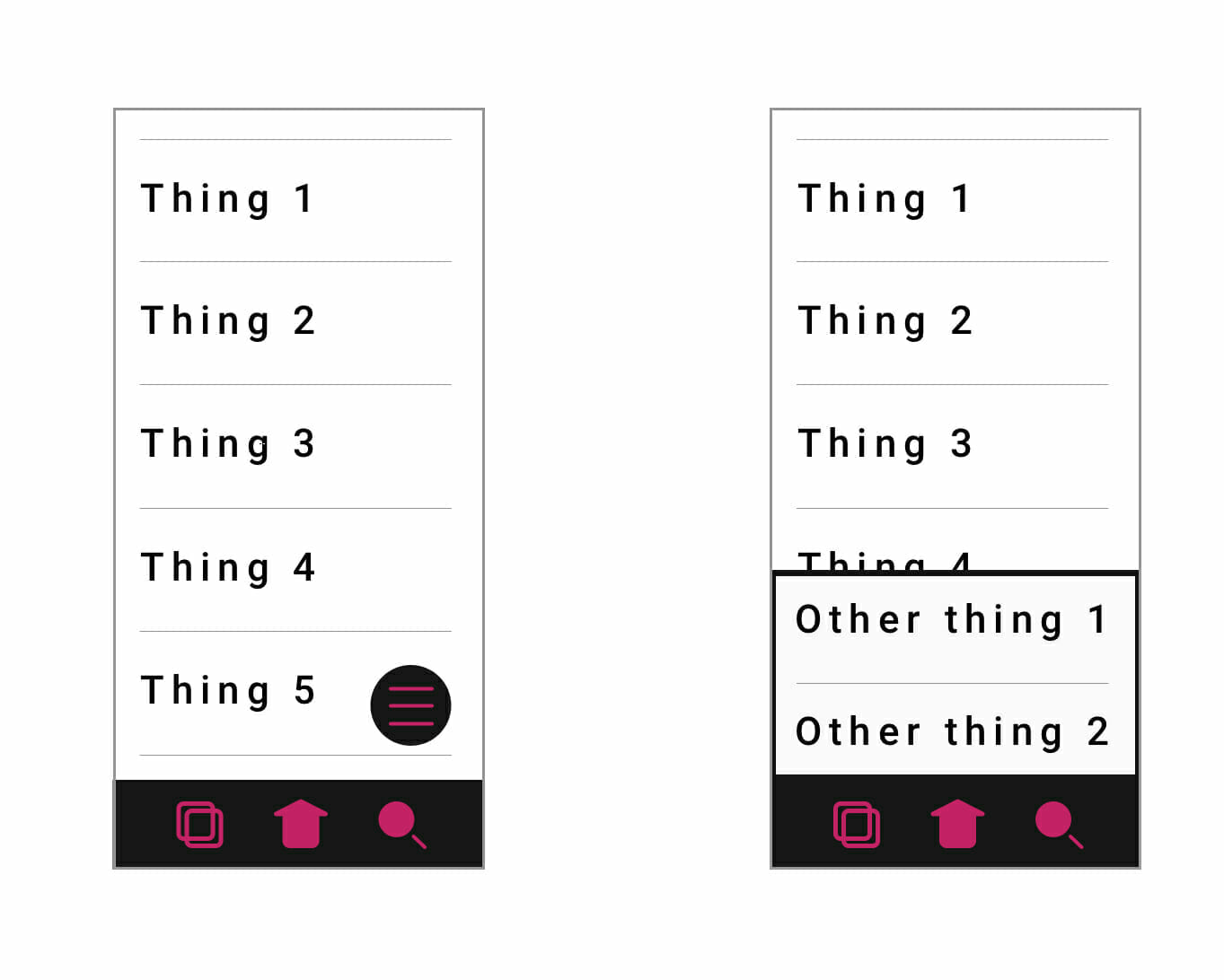
Notice how content is relegated to the top two thirds of the screen, and interactive elements are located in the bottom third. Once something is selected that requires an extra step, the new menu should come up and in from the bottom of the screen from behind the main bottom navigation bar.
This keeps user’s thumb and hand positioned firmly towards the bottom of the screen – making interacting with your app faster, easier, and with a much better UX than with top navigation.
Deep flat
Flat design has reigned supreme for many years now – and all of its benefits are still present in its newest form – deep flat.
Deep flat is simply the idea of utilizing the same flat design elements we all know and love for their visual simplicity and coherence, with added perspective and motion for additional user clarity. It’s much easier to explain visually than through words:
Credit: https://dribbble.com/glebich
While deep flat can make use of gradients to give the idea of depth, it doesn’t have to:
Credit: https://dribbble.com/MarkusM
But, one quality all deep flat design shares is motion. Technically referred to as dynamic functional design, motion is now being used in apps at a much higher rate. But as we’ve stated before, you’ll want to make sure your app doesn’t move around too much – animations should be as satisfying for a user the first time they see it, and the thousandth time.
A general and easy rule to follow if you want to make sure your app’s animations never get annoying is to keep them shorter than half a second.
Deep flat is good practice to get a hold of now, for two reasons: first, apps that are graphic heavy tend to have higher user retention than those that are less so – and second, in a few years, dev shops will expect UI designers to have a solid grasp of deep flat implementation.
Gradient 2.0
Gradients are still used to portray depth on a screen – and until recently, gradients were only lived on screens as shadows – not any longer, however. Device displays have progressed to the point where colored gradients can be described as “vivid” rather than “muddy.”
It’s why all the new devices make sure to have a colored gradient serving as the background of the home screen – they’re showing off how vibrant their rendition of colors can be. Now, color gradients can be used in backgrounds, icons, logos, and all other forms of graphics that make up an app’s UI.
Getting used to implementing color gradients into your UI design now will give you a head start as users begin to ignore less colorful apps in favor of brighter (and therefore more eye-catching) apps.
Gradient 2.0 goes hand in hand with dark mode, which we’ve gone over previously.
Voice
Including voice integration with your app isn’t necessary in 2019 – but it soon will be if you want your user retention to remain stable. Voice AI is becoming more advanced with every passing minute, and soon users will come to appreciate and expect the UX benefits it brings.
Adding voice integration into your app’s UI isn’t very difficult – its functionality is easily indicated with a universal microphone symbol. Implementing this feature into your app’s code base is another story unto itself – a heavy and robust backend architecture is required to support the logic necessary for a voice feature to work properly.
On that note, it’s on to our last top design practice (for this blog, at least):
Learn to code
It isn’t easy – and you don’t have to know everything. But the more you know about the OS you’re designing for, the better of a designer you’ll be. Knowing what the OS you’re designing for is capable of is just as important as knowing how to translate an app’s process into a design users can understand.
If you’d like to learn about the structure of an app made for iOS using Swift, check out: iOS development and Swift code – What you need to know.
For Android, check out: Android development – What you need to know.
We hope you’ve found these ideas helpful, and if you’re looking forward to more app design practices, don’t worry – there’s more coming in the future!


Leave a Reply
Want to join the discussion?Feel free to contribute!