

Five mobile app design ideas
Imagine you’re driving down the highway. Ahead of you are two cars, both of the same make and model, traveling down the road side by side – they’re even the same paint color. Despite these shared qualities, they’re easily distinguishable from each other. Why?
The car on the right is ten years older than the car on the left.
Just as the style of cars seems to evolve every five to ten years, so too do popular app design styles and features – albeit in a much tighter timeframe – and app trends tend to expire and evolve every 5 to ten months.
Due to these rapidly changing mobile design styles, maintaining your app’s user retention basically comes down to playing a continuous game of catch-up; whether it’s with newly thought of updates of your own, or as a response to users expecting a newly invented feature or style.
And if only that was all there was to worry about.
There’s a continuous stream of new devices flooding the market – Apple’s iPhone has a regular release cycle, and there are more Android devices than anyone can keep track of. With these new devices come higher screen resolutions, faster processing power, and in general, the ability to do more.
When phones have features, users expect to be able to use those features while engaging with your app. People buy devices because of the functionality they offer – and due to the continual evolution of mobile device design trends as well. If your app doesn’t account for the new features, resolutions, and capabilities of new devices, your users will stop engaging with your app.
No matter what, you’re going to need to update the design of your app during its lifecycle – but coming up with ideas once, twice, or even three (or more) times a year can get tiring. That’s why we’ve decided to write this blog – to give you some jumping-off points when coming up with new design ideas while updating your app.
If you’re looking for ideas on how to design an app from the very beginning, the following blogs are more in-line with what you’re looking for:
1 – Night Mode
If your app doesn’t already have a night mode, it’s time to implement one. The main purpose of night mode is to reduce your user’s eye strain during, well, the night. There are many other tangential benefits to night mode as well, however:
- Improved legibility
- Reduced eye fatigue
- Less screen flicker (this is a very limited-in-scope issue, but can be a huge detractor to your app’s user retention)
- Less blue light
- Saves on battery usage
Implementing night mode is a relatively straightforward process – it should begin with your designer, who will play with color combinations for the proposed night mode. It’s not exactly as simple as inverting the colors of your app:
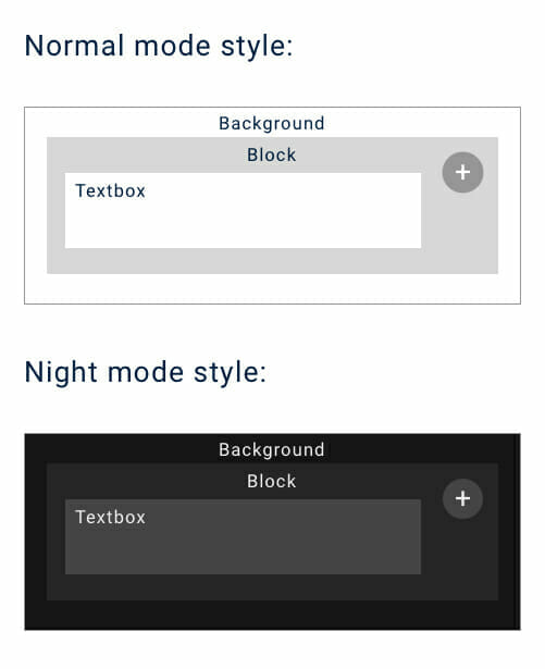
Notice that not all the design elements were perfectly inverted – the background of the night mode isn’t pure black, while the background of the normal mode is pure white. The text of the normal mode is a dark blue – the text in night mode is a very light grey; meanwhile, the button to add another textbox barely changed.
After landing on your color choices, your developers can step in. All that’s left to do is to change the color values already written in the code of your app – a very simple and straightforward process.
There is one more design implementation you need to make in order to ensure the best night mode experience for your users, however; users need an on/off toggle switch they can tap to turn night mode on and off. This is easy for both designers and programmers to implement, so this extra UI improving design feature won’t take too much time to develop.
If your app is for iOS, the code is extremely simple to write. The Swift tag “UISwitch” will provide your app’s users with a ready to use on/off toggle switch – then, it’s just down to placing it in the designer’s desired space.
Perhaps one of the best places to place the on/off toggle switch is in the top right corner of your app – this way, when users engage with your app in a darkened location or time of day, they don’t have to squint at a bright screen in order to find your night mode switch.
You can also consider implementing an auto night mode that enables itself after a certain time of day – this way, users don’t have to worry about pressing an on/off toggle switch.
Night mode is a simple design change that shows your users you care about both their experience using your app, as well as their personal health – implementing is easy and fast, while the improvements to your app’s UX are significant. Due to these factors, night mode is definitely worth the time and money required to implement into your app.
Next, we’re on to…
2 – Bigger, responsive buttons
Much in the same way that website elements (like buttons or image links) became more interactive and graphical as technology advanced (allowing for faster transfer and reading of data), so too are app design elements becoming more visually-oriented as mobile devices (and the introduction of 5G) improve data loading times.
A logical implementation of this is through responsive buttons – just as the header image on this page will respond to you hovering over it, so to are apps beginning to implement this type of responsive design. If you’re an iOS user, the most recognizable implementation of this would be how app icons will shake when you’re in your home screen’s edit mode.
Below, you’ll find a few different options for responsive buttons:
- Swipe-able buttons
- Enlarge-on-contact buttons
- Flippable buttons
Also, why do we recommend making your buttons bigger? Simple – screens are bigger now. Not only do bigger buttons help tie your app’s design together on a bigger screen, they’re also easier for users to tap. If you’re deciding between an intricate and beautiful design, or a simple, easy-to-use and understand design, always go with the latter.
An app that provides easy interaction will beat the beautifully designed app every time – users don’t download apps to marvel at their design (well, we do) – they use your app to help solve a pain point. If a button is easier to tap, you’re helping them solve their pain point faster.
3 – Dynamic functional animation
In the same vein as responsive buttons, you can improve the flow of the entirety of your app by adding dynamic functional animation to its design. The most well-known example of dynamic functional animation would probably be scrolling parallax – which is achievable to implement with newer versions of both iOS and Android.
For an example of scrolling parallax, click here.
Other examples include:
- Highlighting currently interacted with areas
- Auto-zoom content
- Dynamic images
Dynamic functional animation is first and foremost subtle. Rather than standing out on its own, dynamic functional animation serves to strengthen the design of an app itself through animations that are logically and strategically implemented.
Humans are hardwired to acknowledge and respond to movement – it’s what makes it so hard to maintain eye contact during a conversation when something’s moving in the background. Due to this quirk of human nature, design enhanced by animation will usually catch someone’s attention more than a static design.
In short, dynamic functional animation ensures your users give your app more attention.
Dynamic functional animation ensures your users feel like they’re interacting with an actual, tangible tool, rather than pixels on a device’s screen. Animations needn’t be hardware intensive, nor utilize 3D graphics – simple motions like a shake, or colors of elements fading as they scroll over the screen add that extra little bit of UX that helps to keep users engaged.
Even adding a little jiggle when switching between tabs significantly enhances the UX of an app:
Credit: Behance Gallery
There are some limitations you should impose upon yourself when implementing dynamic functional design in your app:
Make sure it’s easy to use
Your app should first and foremost be easy to use – for the same reason explained above in our section about responsive buttons. It’s named functional design for a reason – its implementation has the purpose of enhancing your user’s experience, not detracting (or distracting) from it.
Dynamic design should always be able to be described as “simple.”
Make sure it’s purposeful
Any animation should fit with the functionality it is enhancing. For example, an image tile in a gallery could flip to reveal the photo’s information on the “back” of the photo – this would fit perfectly, as it gives the impression that the images are 3D and have a physical back that information could be written on. A progress bar that flips as it fills up, unlike our photo gallery, doesn’t make sense – and would probably only serve as a distraction.
Make sure it’s not annoying
This is perhaps the most important factor to keep in check – dynamic functional animation can get out of hand very fast.
Tight, quick animations are fine, and add to the UX of your app. A long, drawn out animation only serves to interrupt the flow of your app, and increase the time it takes users to solve their pain point.
Keep your animations short, and your users will stay happy. It might be fun to design and code highly detailed animations – your users might even appreciate the animation the first few times. But the purpose behind updating the design of your app is to increase your user retention – and if users are continually using your app, drawn out animations will quickly become stale.
Make animations that are just as satisfying the thousandth time as the first.
4 – Simplified UI
While we’re on the topic of keeping things short and sweet, let’s take a look at the benefits of simplifying your app’s UI.
We touched on this briefly in the first section of this blog already, but its’ importance warrants a more detailed overview. A simple UI will always be better than a complicated one – no matter how much extra functionality a complicated app’s UI provides its users, the simpler competitor with half the functionality will most likely be more popular.
This is due to the same reason there’s such thing as a universal remote. There’s nothing more annoying than having to use three different remotes to watch a show on your TV. We tend to get frustrated as we’re presented with barriers such as these; in this example, we want to watch TV. Not play with remotes. For every extra remote we need to use, it’s an extra barrier to watching our show.
The same goes for apps. For every step a user must take to complete a session in your app, another barrier has essentially been added between where the user is in their session, and the solution to your app’s pain point.
Designing an app is like creating a sculpture made of marble – it’s a subtractive, rather than additive process. During the ideation stage of any app, it’s important to narrow the scope of your app to its core functionalities – from there, you can add extra features. But remember – for each feature added that’s necessary in the process of using your app, you are creating another barrier between your users and the solution to their pain point.
Don’t make them use three remotes to finish a session in your app.
Just as it’s wise to narrow down the scope of an app during its initial ideation, so too is it important to do the same when updating your app. An easy way to ensure practical application of simple UI updates is to treat updating your app as if the update is a MVP.
The easiest method of implementing simple design updates is to create a list with everything you want your update to include, and then try to connect every bullet on that list to the main pain point of your app. If an item on your app’s update wishlist doesn’t help to solve the pain point, or improve the experience of using your app, it most likely isn’t needed.
There is something we want to clarify – a simple and concise UI doesn’t always mean simple code, nor quick design. Dynamic functional animation will not be simple to program, just as a simple-to-understand design could take hundreds of hours to achieve.
A simple implementation of dynamic functional animation is measured by how much (or lack of) interruption it provides in the process of using your app – the more interruption or delay in the flow, the less simple (for the user) it would be.
5 – Color Palettes
Circling back to the same vein as night mode, switching up your app’s palette can go a long way toward improving your app’s user retention.
Picking new color schemes is fun, and the actual implementation of such is fairly easy (and we already covered it in the night mode section of this blog) – but we do want to cover the timing and methods behind putting a fresh coat of paint on your app.
A/B testing
A/B testing is switching out one piece of content with another, and then recording the results. In this case, rather than switching out actual content, you’d switch, for example, the color of your header text from blue to red, and then watch and record how your users react.
In order to successfully run an A/B test, you’ll need to record all of your user data prior to the test for the same duration that the test will run. Then, implement the changes to your app through an update. Record the data that follows, and then compare the two sets of data. If you want to be extra through, you can repeat this process multiple times to ensure your samples aren’t skewed.
From here, you can permanently implement the color palette that is best for your app’s user retention.
Situational updates
When it comes to updates, timing is everything. In order to capitalize on upcoming cultural events or holidays your users celebrate or engage in, you can update your app’s color palette for the duration of that time period.
For example, a shopping app could update its color scheme to match the next upcoming holiday – changes like these can help put people in the holiday shopping mood. Now, keep in mind that this doesn’t mean this shopping app would change its normal color palette of white, blue, and orange to green, red, and white for Christmas. Rather, small hints of Christmas colors could be interspersed throughout the app.
There’s an infinite number of app design ideas…
But that’s all we have for now. We hope you’ve found this blog helpful in serving as a jumping-off point for your app’s new design.
If you’d like to keep reading about app design, check out our blog on how design impacts the cost of your app.
We’ll blog about more app design ideas in the future, so stay tuned for more!


Leave a Reply
Want to join the discussion?Feel free to contribute!