
The language of app design
What message is your app’s design communicating to your users? Visual design (and UI design in this case specifically) has a language unto itself, and like it or not, your app’s users are reading between the lines.
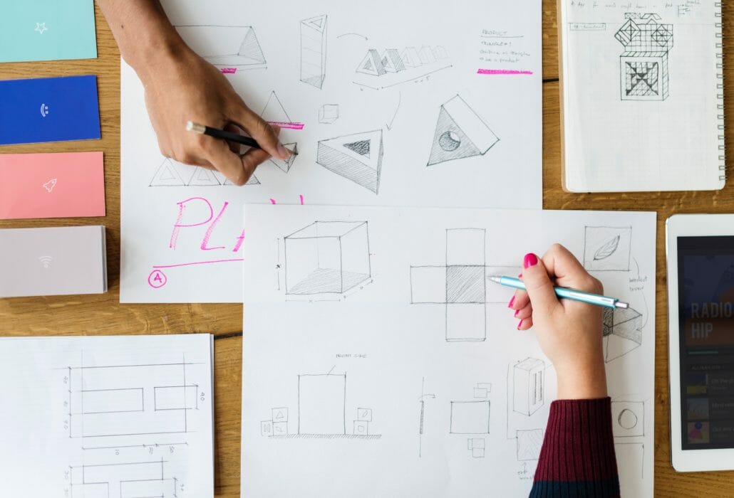
Visual design is based upon universal principles easily understood by everyone. For example, below, you’ll see two arrows – one pointing left, and one pointing right (or starboard and port, if that floats your boat):
Now, which one is pointing forwards, and which one is pointing backwards?
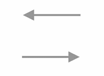
Or, if we were to flip this idea on its side; based on the two arrows below, which is pointing north, and which is pointing south?
Almost instinctually, your brain knew the answers. You might have even made those visual associations before the questions were posed. These associations come from the language of visual design – taking a left turn in a car doesn’t necessarily mean you’re going backwards, just as walking up a staircase doesn’t mean you’re headed in a northernly direction – our brains only associate an arrow pointing left with the meaning of “backwards” in certain contexts.
This is why you don’t need to be a professional UI/UX designer to understand when an app “feels” wrong – our brains are trained to take in visual information in certain patterns, using standard hierarchies.
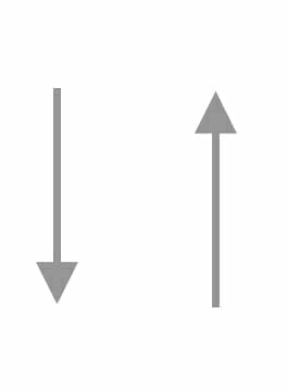
Take, for example, what happens when the same left arrow is placed next to the universal sign for “bathroom.”
All of a sudden, there’s no way this arrow means “backwards.” Visual design is precise, and the patterns our brains are trained to recognize mean something. If the design of your app isn’t getting the message across to your users, you’re severely shortchanging yourself, and your app’s chance at success.
Platform design principles
Just because there’s a universal language of design doesn’t mean everything looks the same (thank goodness). Both Apple and Google have their own design principles and schools of thought – those being the Human Interface Guidelines, and Material Design, respectively.
While these OS specific UI design guidelines do cover the more detailed aspects of design, such as typefaces and font use cases (those being San Francisco for iOS, and Roboto for Android), they mainly cover high-level design choices like those of hierarchy of information, menu placement and organization, and text alignment.
This is the reason it’s important to remain cognizant of which platform you are designing for, and why it’s bad practice to simply copy and past the design of an app when developing for both Android and iOS.
For example, iOS users will be familiar with the top menu on the left, and Android users will similarly find the top menu on the right to be familiar:
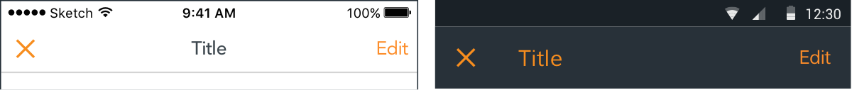
(Image from this blog by Cory McArthur)
If we were to simplify these design to their wireframe layouts, they would appear as such:
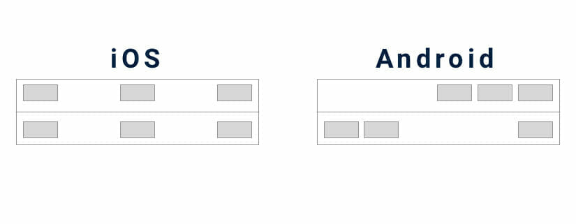
While both present network information, time, and battery usage at the top of this menu, they are located in different positions – both are easily understood, but use different design styles – iOS being making use of center-justified design, and Android left/right justification.
These design styles are made with the intention of being easy to understand – and while they both are, users come to learn and prefer the feel of either Human Interface or Material Design as they interact with either iOS or Android.
Design and user retention
There’s the old adage, “don’t judge a book by its cover.” A saying such as this rings true because the cover doesn’t actually detract from the user’s experience while engaging with the book – the cover is the least-looked-at part of a book while being used.
The direct opposite is true of apps – a poorly-designed app will provide a subpar user experience. An app that suffers from poor design will be difficult to comprehend; and as such, the book’s equivalent of bad UX would be a novel printed with yellow ink on white pages.
According to this blog from Medium, a study conducted in Canada found that a poorly-designed platform actually makes accomplishing the task it was designed to complete more difficult than when compared to a well-designed platform.
It largely comes down to user psychology – a more pleasant experience puts the user into a better mood, which creates a more engaging experience for the user, which means they pay more attention to the app’s flow, which then improves their knowledge retention, which leads them to feel familiar with the app.
Before long, positive feelings are associated with the app – while this is largely dependent on the solution to the pain point the app provides, the experience of arriving at that solution can either be enhanced or tarnished by the UI of an app.
According to this user retention guide from CleverTap, the most important goal of user retention is to “create an immediate, immersive encounter with the app’s unique value.”
In order to do that, you’ll need to create a well-designed UI, so users feel drawn into the experience of your app. No one wants to look at an ugly app for long.
An overview of UI design
UI can be broken down into a few categories when it comes to the interactive design elements UI is created from: navigation, menus, and buttons. Graphics, despite adding significant value to an app’s UI, aren’t truly part of the interactive aspect of an app, other than symbols or icons that may be selected in a menu, such as a “home” button or “shopping cart” button.
Navigation
- Gestures: Gestures such as swiping or pinching provide tactile methods for users to navigate through, or engage with apps.
- Screen transitions: Either modal (coming in from the bottom), or push (coming in from the side), screen transitions can simplicity explain if a user has moved on to the next step (push), or entered a sub-step (modal).
Menus
- Bottom navigation bar: Mainly found in iOS app design, the bottom navigation bar provides an area that showcases all of the app’s navigation options to a user; for example, home, order, review, profile, and much more. Each icon will lead to a different screen, which can then be engaged with to progress through the flow of the app.
- Hamburger menu: Mainly found in Android apps, the hamburger menu is named as such because it is denoted by a button with three horizontal lines stacked vertically over one another, creating a “hamburger.” This menu will usually expand from the button after being pressed, and is often a push transition.
- Alerts: Alerts function as small menus, and will often “pop up” when the user has input an action the app must verify. For example, if a user were to clear their cart before completing an order, an alert would pop up, asking if the user indeed intended to clear out their cart, with the option of either pressing “yes” or “no.”
Buttons
There are many types of buttons, but as their name implies, they all require the user the press them in order to function. Some common buttons found throughout app design are: share, add, switches, pickers, and checkboxes.
Next month, we’ll release a complete glossary of UI design terms for you – but if you’d like to continue learning about app design, check out our blogs, Five mobile app design ideas, and Top app design practices – 2019.


Leave a Reply
Want to join the discussion?Feel free to contribute!