Meet our newest CBO

We’re here with our newest CBO – Flea Van Schaack. We’ve been searching for a Chief Barking Officer for a while now, and we’ve finally found the perfect fit! Ever since we brought on Jacapo Lingenfelter as our CTO (Chief Terrier Officer), we’ve been searching for our next addition to the team.

Flea has been with us for just over a month now, and we thought it was a good time to share what Flea has brought to NS804 in the short time he’s been a leading member here.

First, tell us a little about yourself:

Yeah, sure thing Kate! First, I’d like to thank you for having me here – It’s been a really exciting first month, and I can’t wait to talk about it. I know you’re busy, so I’ll try to keep everything as quick as possible.

Um, thanks Flea – but I’m just doing my job.

Yeah, great! Well – um, sorry, this is a little awkward – I tend to try and stay humble. You know, being a good boy and all that.

So, when I was growing up, I always knew I wanted to help make people’s dreams a reality – I went to school and graduated with a degree in business leadership – I was hoping to start my own chew toy company. I figured, “Hey, I’m always dreaming about chew toys. I should make my own and help make other people’s dreams come true.”

Well, long story short – turns out the market out there is ruff.

And that’s when you decided to start working with NS804?

Yes – I appreciated that our goals aligned so perfectly. I mean – it even says it right there on our conference room sign: “Making dreams a reality!”

How much more perfect of a fit could you ask for?

What’s your favorite part about working for NS804?

I want to say it’s about the chew toys – I really do. But if I were to be honest, it would be the people I get to work with. They say a good manager works for their employees, not the other way around. I always make sure to carry that advice with me – I find the harder I work for my team, the better everyone feels, and the better work we produce.

When you’re working at a company, and you’ve got that capital “C” at the beginning of your title, this is especially important – I could talk all day about the technical and strategic side of what we do here – everything from perfecting new peer-to-peer data sharing techniques to managing the backend for a significant number of apps.

I always make sure to take the time every day to check in with my entire team – keeping up with your employees is hugely important for team cohesion and individual productivity.

What are you most excited about for your future with NS804?

Oh boy – there’s so much I’m excited about! But, if you’re going to make me choose just one thing… It’s a new full package ASO program we’ve been working on. I’m not allowed to say too much about it – but we’re excited about the implications this new project will have on user acquisition and conversion rates.

How to: Build a MVP startup

Sometimes, the only thing stopping a great idea from seeing the light of day (and consumer’s eyes) is a little know-how. If you’ve had a great idea for a MVP app for a while now, and want to start your own business based around it – but have no idea where to begin – we have the answers for you!

Below, you’ll find your roadmap detailing how to build a MVP startup app.

A strong MVP

The stronger the idea behind your MVP, the better your chances are at achieving success. While there’s no strict formula for coming up with a good idea, there are qualities most good ideas have: stickiness, simplicity, and legs.

If none of those words made sense in context, don’t worry. Their explanations (as well as the definition of a MVP, in case you don’t know) are coming right up:

First of all, a MVP, in regards to an app, is an app that focuses on providing an experience through a set of features that play a direct role in solving a user’s pain point. A MVP app has enough design elements to provide a good UI/UX for the user, and is a viable product unto itself. It is, however, a minimal version of said product, and offers little functionality other than that which helps to solve the main pain point.

Good ideas tell a story

So, what about those qualities mentioned earlier? Urban legends, ghost stories, and memes are all perfect examples of ideas with all three of those qualities: stickiness, simplicity, and legs. Let’s look at the idea behind everyone’s favorite supernatural-bathroom-mirror-murderer: the Candyman.

The idea of a man filled with bees, crawling out of your mirror and attempting to grab you with a hooked hand is a pretty difficult image to get out of your head. It’s a simple idea – tempt fate by saying his name three times in a bathroom mirror, and he’ll come to get you.

It’s got legs as well – the story of the Candyman is highly replicable. This is because it uses a well known setting – the bathroom – and uses concrete, reliable, and common features as details to ground the story in reality. All a story teller needs is a little imagination to truly paint their audience a picture; and because audiences are so familiar with the territory of the bathroom, they can fill in details themselves, and tweak the story to their own tastes.

That audience will then go out and spread the idea again – it’s memorable, simple, and replicable.

Now, you’re not here to sell ghost stories – but good brands share these same qualities. For example, let’s look at Nike’s “Just Do It.”

It sticks in your head – it’s a powerful statement, with no room for interpretation; if you’ve got an obstacle in your path, your determination is all you need to surpass it. Their slogan is simple as well – it’s three words, all single syllable, all easy to understand.

Finally, it has legs; “it” is an incredibly diverse word, and because of this, “it” works for any product Nike sells – whether they’re selling shoes or hats – and whether their customers are skateboarding or playing soccer, “it” is getting done.

Sticky apps

Now, let’s take that urban legend example, and do the same thing with a well known app… let’s go with Uber.

First, Uber is a sticky name – it’s fun to say, fast, and carries the wonderful connotation of “great” with it. The idea behind the app is sticky as well; all a user has to do is hail a cab with their phone, and soon enough, a car will be there for them. Most of the time, they don’t even have to talk to anyone – the task is simply completed with a few button presses.

To put it simply, it’s a simple idea: press a button, get a cab.

Due to the idea behind Uber being so simple, the app itself (in regards to UX) is simple as well – over the course of interacting with only a few different screens, a user can get a ride from one side of town to the other.

The simple experience Uber offers is the reason it (and other services like it) are handily beating out traditional taxi services – pressing a button is much easier than searching for, and then hailing a traditional cab.

Finally, Uber most definitely has legs. The app serves two different user groups in a highly replicable way – one user group gives rides, while the other takes rides – and both user groups are likely to return as Uber customers, as drivers’ economic pain point is solved by riders, and riders’ transportation pain point is solved by drivers.

Perhaps the reason for Uber’s market-shattering effects was due to its market viability – because it was the first app to shake up the taxi industry, it was able to gain users with zero competition until other companies could eventually catch up.

This feature set would create a system for raccoons to share advice with each other, as well as a community based around the app.

An untapped market is the perfect opportunity for a MVP app; and because of this, Uber is the perfect example of how to build a startup around a MVP.

It’s essential, however, to make it clear that being the first doesn’t ensure that you will remain in first place – someone can (and often will) come along and do what you do, but better. App users are fickle, and are more likely to abandon an app than they are to continue using it.

Because of this, if a new app does come along and implement even just a single feature better than your app, users will migrate to the new one – in order to combat this, you must always continuously update your app. This means everything from security updates, UI changes, and sweeping, innovative changes to your app’s UX.

Product Validation

There are two different audiences that must deem your app as viable: the marketplace, and your intended users. The purpose behind receiving validation from these audiences is to ensure your app has a place to live, and value to bring.

Let’s get into what being a viable product really means:

Marketability

There are a few factors that come into play here, but the most important (when it comes to a MVP app’s market viability) is competition.

There’s three reasons to go with MVP app development: lack of budget, proof-of-concept, or speed to market. Sometimes, it’s a mixture of these factors, and other times, it’s all three. But while MVP apps do significantly reduce your development costs, and do serve extremely well as a proof-of-concept for potential investors, a MVP app’s real strength, as stated previously, is due to its speed to market.

If there’s an audience of users deeming a product as viable, and no competition for a share of that audience, you can use a MVP model of app development to ensure you beat anyone else to the punch. When you’re the first brand to provide a solution to an audience’s pain point, you’re more likely to build customer loyalty than the third or fourth contender.

If you are the third or fourth contender, however, you’re also in a perfect position to strike – conduct your own competitor analysis of apps that do what you plan to do with yours. Then, come up with better ways to implement the solution to your pain point. When you’re entering an already tapped market, competitor research isn’t just necessary – it’s your ultimate weapon.

Consumer viability

In order to determine who your niche is, you must first determine where your niche is. This is important to keep in mind, as sometimes, a specific audience might invalidate your product – but this doesn’t mean every group will. If your idea is rejected, it doesn’t mean it’s a bad product. You might just be talking to the wrong people.

To better identify your target audience, you need to know your app’s user journey.

The user journey

If Uber had marketed the driver side of their app to professional taxi drivers, and the user side to suburban, middle-age, middle-income mothers, it probably would have flopped. Taxi drivers have no use for the app, as their customer base flags them down visually. Suburban moms usually have their own transportation, and rather than needing rides to places, they are usually giving rides themselves.

Uber made the splash it did because it understood its user’s journey. While there are multiple Uber customer types, their main base is urban, younger, on-the-move, and lacks one crucial thing: private transportation. They have enough money to be able to afford something more expensive than the subway or bus, but don’t have the funds (or lack the space) for their own car.

That’s a very different audience than suburban moms. The timing of the 2008 recession, and Uber’s 2009 launch were extremely beneficial to its success as well – and the gig economy owes a significant debt of gratitude to Uber.

Uber took advantage of a market overflowing with available labor – if you had a car, you could work. You could set your own hours, and work around another part time job. With so many young people in 2009 either un-or-under-employed, Uber was able to grab hold of a significant amount of users for the driver side of their app.

They were able to make all of these smart decisions because they understood the user journey of their app. The best way to determine your user journey is to ask yourself; “What would I want this app to achieve?”

Then, go out and ask people what they think. Let your intuition guide you to the right audience – and then, let your audience guide you to the true pain point.

Understand your success criteria

This might seem pretty obvious, but knowing what makes your app successful is important – knowing your goals will give you the data you need to measure your success.

You define what a successful MVP app looks like – whether it’s number of downloads, user retention, or a workable proof-of-concept for investors.

Keep it simple

If a MVP app were to be compared to a football play, it’d be a Hail Mary. There’s really only one point to all the plays, picks, and blocks that happen in a game of football – to get the ball to the endzone. A Hail Mary, just like a MVP app, achieves that purpose using the simplest method with the least amount of steps possible.

If you’re building a startup around a MVP app, think of it as a Hail Mary – the faster you release your app, the faster it gets to your audience, and the farther it spreads among them.

Easy app development

How hard can developing an app really be? They’re pretty much just mobile versions of websites anyway – going the route of hybrid or web based apps should save both time and money, right?

On the surface, these assumptions would seem correct – but for many reasons (which we’ll get into below), taking short cuts or going with a route other than native development will actually create more headaches, and ultimately make your app’s development more difficult.

What about going easy on the market research? Surely apps don’t need to include a traditional marketing budget – that’s what the App Store is for.

Things sure would be easier if that were true – apps require fully fledged ASO campaigns in order to survive against their competition.

There’s a lot that goes into developing an app – and we’ve never said it was easy (in fact, we’ve said the opposite in the past), but we’ve put together the info you need to know in order to make sure your app’s development is as easy as possible.

Fish out of water

Who’s the better swimmer – a penguin, or a dolphin? The dolphin will win in the water every time. Now, I’m not trying to take a shot at penguins – they’re way better at swimming than I am – but they exist in a space between land and sea. They’re never truly in their element; they’re clumsy at best on land, and when in the water, they’re hampered by adaptations specific to land animals.

In essence, they’re very similar when compared to both a hybrid or progressive web app. There is no argument that your initial costs will be lower when going the route of hybrid development; but over time, a natively developed app will perform better than a hybrid on many fronts.

When measuring for usability, performance, security, and maintenance, a native app will beat out a hybrid every time – just like, and for the same reasons as, the penguin vs. dolphin match up.

Visit our blog for a more detailed explanation as to the benefits of native over hybrid development.

Before you find a developer

It’s time for the first step in building your app: finding a pain point. Every app helps to solve a problem in someone’s life – mobile games stave off boredom, fitness apps help to solve our issues with laziness, and navigation apps provide the answer to “How do I get around this accident?”

No matter what your app does, when you boil it down to its true essence, it helps people solve pain points they are faced with throughout the day – or if you’re making a sleep tracker app, throughout the night.

But ultimately, your app helps people. If you’re making a mobile game, the formula is pretty simple – build an app that’s entertaining enough to make people want to play it to pass the time during their morning commute on the train.

For more complex concepts (ideas, not apps – mobile games are some of the most technically complex apps out there), the process of ideation becomes much more involved. Unless you’re developing an app based on inspiration that came to you from facing a pain point in your own life, the easiest way to come up with a (good) app idea is to conduct some…

Market Research

Now, in order to know what to research, you’ll need at least some form of an idea of what you want your app to do – but market research will help you narrow down that broad idea into a marketable product.

Let’s pretend we’re making an app for raccoons. We don’t know too much about the raccoon life – but we’re going to go out on a limb, and guess that this app is in some way going to revolve around getting their little paws on some trash.

We honestly don’t know what the raccoons want, however, so we need to go to the source – unfortunately for us, most of the focus groups and field research probably won’t be held in the cleanest venues.

Okay – so, it turns out, according from our totally real research, that raccoons do indeed face a pain point when it comes to trash acquisition – it isn’t, however, the pain point us humans would expect. Finding the trash isn’t the problem – our target audience’s noses are fine tuned for that sort of work.

Raccoons need an app that gives them the ability to leave other raccoons instructions on how to open the dumpsters that hold all that delicious garbage. As our market research shows, finding the trash isn’t the problem – accessing it is.

So now it’s time to figure out the solution to the trash acquisition problem.

Designing your app

There’s two separate times you’ll design your app – the first instance being the step we’re currently on: user stories.

A user story is the step-by-step process a user will take when interacting with an app. In our case, it would be a raccoon currently stumped by a particularly stubborn dumpster lid.

There are a few things you need to think about when coming up with user stories:

  • Location
  • Situation
  • Mood
  • Method of interaction

The location and situation your users will be in when interacting with your app matters – as well as the mood you can expect them to be in. In our case, the location, at least most of the time, will be back alleys, and mostly at night. We can expect our users to be hungry, and therefore impatient.

Now, with a clear picture of the situation, location, and mood our users will be in, we can start designing the flow of our app.

First of all, we need to revisit the pain point; raccoons want the ability to share advice with each other on how to open up dumpsters, in order to get to trash faster.

So, now we need to design a feature set that will help to solve that pain point. Our app must include:

  • GPS and mapping, as well as location services, in order for users to place beacons on a map for other users to select
  • Camera and microphone access so users can take photo and video instructions
  • Back end integration so the app itself can host photo and video media
  • User profiles that can be rated based on the advice they provide

So, add all that up, and you get an app that allows users to pin video and photo instructions to specific dumpsters based on their GPS coordinates. Other users would then be able to vote on the provided advice, which would then be posted to that user’s profile.

This feature set would create a system for raccoons to share advice with each other, as well as a community based around the app.

Time to build

Next, you’ll want to take your research and user story, and bring it to an app developer. From here, they’ll be able to take your idea and run with it. From here, development is pretty much out of your hands – you’re there to give the thumbs up or down.

A full, in-house development shop will usually start by designing the layout of an app with wireframes, and then flesh out the design. Once the design for each screen has been finalized, a prototype will be built – this is for you to look over, so you can make sure their interpretation of your vision is accurate, and to the spirit of what you imagined.

The developers coding your app will reference the prototype as well – and from it, they will build the actual code of your app. After your app is coded, it will move on to testing, and from there, it’s on to…

Launch

Remember when we brought up ASO? This is where you’ll want to implement those efforts. There’s a lot that goes into an ASO campaign, and if you’d like to take a deep dive on the topic, here’s a blog all about it.

ASO, at its core, is keyword research and implementation. It’s just like SEO, but for the App Store and Google Play. We recommend new apps start with five keywords to focus on – and from there start evolving your ASO campaign with strategies ranging from A/B testing to push notifications.

The key to a long-lasting, successful app is frequent updates. Once you’ve launched your app, you’ll want to get right back to developing it – top performing apps update regularly to stay on top of design trends, security issues, and new devices.

This is a big reason native apps are more cost effective and easier to develop than hybrid – maintaining and updating a native app is a much simpler process.

The tortoise and the hare

If you’re developing an app the right way, there’s no such thing as easy development. You can, however, save a lot of headaches and backtracking by carefully planning and building your app. Do as much research as you can, and continuously test your app as you build it. Remember – slow and steady wins the race.

How to: Get a low cost app developed

What’s the key to low cost mobile app development? Preparedness. But how are you supposed to know how to prepare if you’ve never built an app before?

Well, as soon as it began, your search is over – below, you’ll find a step-by-step guide to the quickest and most affordable model of mobile app development: MVP.

Really quick – before we get into it, let’s go over what a Minimum Viable Product is (when it comes to apps, at least). A MVP is an app that focuses on solving its main pain point, and very little else. All features, design, and graphics focus on helping to provide a solution to the main pain point – hence the term “minimum.”

MVPs do one thing, and they do it well.

Now, here’s how you make one:

Step 1: Research

This is all about how to build an app for the lowest cost possible; and the key to all development costs boils down to one singular ingredient – time.

Your app’s design is crafted through a combination of creative thinking, mouse clicks, and keystrokes; your app’s code is built by process-oriented imagination, and a whole lot of keys being pressed in rapid succession on a keyboard. There’s nothing magical about the development of an app.

Now, this isn’t written with the intention of giving the impression that developing an app is easy – quite the opposite, in fact. Building an app is kind of like writing an interactive choose-your-own-adventure novel, but it’s written in a language computers can understand, while also remaining readable for us humans.

And in order to pull that off in a streamlined, cost-effective manner, you need to complete all of your research before going to a developer with your app.

Find out why we recommend against using services like Appy Pie or app design templates to build your app.

The first step to research is…

Determining your pain point

All apps are beholden to one goal: solving their pain point. For a MVP to be a MVP, however, it must only provide the solution to its pain point. Any feature included in a MVP app must play a role in helping to solve this problem – this is to ensure no time is wasted spent developing out features that aren’t truly needed for users to receive enjoyment and benefit from your app.

The reason this is your first step taken on the road of app development is because everything that you do during the development process will be determined by the pain point of your app – from the market research you conduct to the features your developers implement.

A good pain point is both marketable and actionable – meaning there’s an audience or group of people who want a solution to this particular problem, and are willing to do something about said problem.

Let’s say you’re making an app like BrewTrader – just for some context, it’s an app that gives craft beer enthusiasts a platform to find and trade beers with other users.

Take a second to analyze that sentence. You know you’ve come up with a good pain point when you can explain the whole idea of your app in one sentence. Think of it like a thesis statement; if you can’t construct a grammatically correct sentence that covers the entirety of your app’s functionality, your MVP isn’t focused enough. It should be succinct, but meaty.

After knowing the problem you want to solve, and how you want to help solve it, you can move on to the next step of research:

Competitive analysis

This step serves two purposes – it gives you an idea of what your competitors are currently doing (obviously) – but more importantly, it will serve as a roadmap for ideating your app’s feature set.

If you want your app’s development to be quick, (and therefore low cost), you’ll need to know every feature your app will utilize; this includes knowing details like where in the user flow a feature will exist, how it will interact with the user, and if you’ll need supplemental features or APIs in order to properly implement the original feature.

Download the top three competitors and use their apps for at least one session from start to finish. Get an understanding of what they do correctly, and make a note for later. Then, go find the lowest rated app (be careful about security risks) in the same category, and pay attention to what they did wrong.

Knowing what’s incorrect is just as important as knowing proper UI/UX design. It helps to prevent you from making a decision that might seem like the makings of a previously-unimagined and creative UI/UX solution – but there is more than likely a reason the top performers use the UI/UX flow they already have.

Also, begin your ASO research now – pay attention to keywords the top competitors are using. When starting out with a new app on the App Store or Google Play, pick five keywords, and focus in on those.

Market research and marketing

There’s a million different options for conducting your market research, but some key data to be aware of are:

  • Target age range (different age groups respond to different mobile marketing strategies)
  • Target preferred platform (we recommend iOS if you’re starting with a MVP)
  • Target interests

As soon as you know what your app will be called, you have a logo, and you have a description of what your app will do, build a website. Even if you only have content for one landing page, make it, and make it live.

SEO takes a while to take hold, and having something to link back to within your social campaigns will help to build a solid SEO foundation. Apps on the App Store and Google Play require both SEO and ASO to thrive – so don’t neglect either.

Speaking of social media, you’ll want to make sure you’re putting out as much content as possible. Speak to the voice of your app’s brand, of course, but don’t be afraid to open up a little. Everyone understands that when they’re interacting with a brand’s social media account, they’re talking to an actual human being.

Be open and honest and genuine – know your target audience’s interests, and speak to them. To steal advice from Gary V, if they like the Red Sox, talk about the most recent Sox game. Engage with your followers more than you advertise to them. Then, every once in a while, sprinkle in some native content that speaks about your app’s brand, or the features it will provide, or where you are in development.

People love documentation. You can easily create content for social media by documenting the journey you’re on through the development of your MVP app – take one long-form piece of content, and build a few pieces from it each day. Then cater those pieces to each social platform your brand is on. All of a sudden, you’ll be running a fully-fledged social campaign based on a single piece of content (that you didn’t even have to take time out of your day to make).

MVP development

Whether you’re developing an MVP app or a fully-kitted-out enterprise level app, the actual process of coding remains largely the same – the only difference is the time table, which is shorter with a MVP, due to the limited feature set that needs to be built and implemented.

The importance placed on knowing your feature set in and out comes into play here – the most effective and efficient way to ensure easy, low cost app development is to make sure there’s no unanswered questions between your vision, what you want, and how you want it to work.

The clearer of a picture you can give, the more information, and the more concrete of a user flow you can produce for a developer, the better. It’s always important to take your developer’s advice, but relying on your own research and business acumen can help speed up the process.

One thing to keep in mind with (and this is specific to) MVP development is that everything doesn’t necessarily have to be perfect. Don’t confuse this with the idea that it’s okay to make a sloppy app – but understand that as long as your users know that your app is in a semi-beta stage, they’ll be more forgiving.

This is why a strong, personal, and open social media presence is so crucial to a MVP app’s success; in order to properly distribute the message that your app is starting with humbler-than-most beginnings (but improvements will be coming), you need to be able to have frank, honest, transparent conversations with your followers. And, they need to be willing to listen.

The purpose of a MVP app is fast, efficient development – the efficiency truly begins to shine after a MVP app’s initial development.

The second word in the acronym MVP is viable. It might be the most barebones version of a product, but it’s still viable. What this means for you is that you can charge for it. Whether your app goes with a pay-to-play model, or subscription to a service, or with sales from ad revenue, you can begin to make a profit from your MVP as soon as it takes hold on the App Store or Google Play.

Post MVP development

As soon as your app is launched on the App Store or Google Play, make sure:

  1. Your ASO is in place and ready to go
  2. Your website reflects the launch of your app
  3. Your social media has (and will continue to) promote your app’s launch

Take the revenue you’re making from your live MVP app, and start implementing updates. Make sure updates focus on fixing bugs, fixing security risks, and providing quality of life improvements to the UI and UX flow.

Be vocal and transparent about what your updates will accomplish and feature – use both social media and push notifications to advertise these updates.

Be aware that when you’re advertising, you need to be extremely aware of just who you’re engaging with. Older generations, like generation X, prefer value-based advertising. As your target market gets younger, they will expect more personalized advertising – in order to properly do this, it’s necessary to use an app analytics platform. Our favorite is Kumulos.

Be prepared, but be ready to adapt

Knowing what you’re getting into is the most important step you can take to ensuring low cost development – but, always be ready for something unexpected to pop up.

To learn more about the in’s-and-out’s of MVP app development, check out our blogs on:

And, for more about planning out an ASO campaign, check out our ASO: 101 blog post.

With carefully planned feature sets, a concrete layout and vision, and some well-planned and executed social media, SEO, and ASO, you can both shorten your app’s development schedule, and lessen your need for monetary investment; giving you the ability to make an app now, and capitalize on an untapped market – rather than waiting for outside investment and finding a highly competitive and saturated playing field.

Improving your employee training process with an internal business app

An enterprise level, internal business app is the perfect solution for innovating your company’s employee training. More accessible and less resource intensive than traditional employee training programs, internal business apps are, most importantly, much more cost and time efficient than their traditional predecessors.

Internal business apps provide a platform that empowers the growth of your employees – as individuals, professionals, and team members – all scalable, and all within an affordable budget.

Before we get into the how of this topic, I want to cover the why:

The psychology of self-fulfillment apps

Just what is a self-fulfillment app? It’s any app that helps an individual better themselves – while they exist in different spaces, fitness trackers and internal business apps would both fall into this classification.

In fact, when implemented correctly, the structure and UX of the training portion of an internal business app should closely resemble that of a fitness app.

They’re very similar to each other, especially when the internal business app is used to provide or enhance your employees’ training – and just like a fitness app, your internal business app’s training program should focus on rewarding your employees for reaching action or comprehension milestones while on their path of growth.

Why is this? Just as fitness apps use this milestone method to increase user engagement and retention, so too can your internal business app. While employee training might be a virtually mandatory step in the hiring process, this doesn’t mean employees are highly – or sometimes, even moderately – engaged with the process.

With many new positions, employees going through training can find themselves inundated with excess amounts of new information – this can lead to overload, or even to your new employees tuning out for the rest of their training.

By implementing a rewarding, individually-trackable training experience for new employees, you can rid your company of these systemic issues. The best part is, this process doesn’t have to come to a close – internal business apps can empower your employees’ growth throughout their entire career at your company.

Let’s get into some concrete examples:

On-boarding

Imagine being able to start new employee orientation as soon as they’ve signed their offer letter. Along with the email you’ve sent, you can also include a link to your enterprise app. From here, the new employee can complete paperwork that usually takes up a significant portion of their first day.

During this first touch your new employee has with your business’ internal culture and processes, you can adjust the amount of guidance to whatever fits your needs – from live chat features to video calls. Or, you can go the fully automated route, if this portion of your on-boarding needs to be streamlined.

As your new employees progress through orientation, your app can act as their own guide, keeping them appraised of what’s coming next in the training process. This helps them prepare before hand, lessening the time spent introducing the topic that is about to be taught, or from scrambling for necessary resources at the last minute.

Your internal app can also act as a reference point during any step in the new employee training process, allowing new employees to find answers without interrupting training sessions.

When new employees have the power to look back and see the entirety of what they’ve learned (as well as the ability to reference the details of your business’ processes), they’re less likely to feel overwhelmed, and more likely to feel in control – and therefore, are more likely to fully engage with their training.

New employee on-the-job training

While nothing beats human interaction when being taught a new subject or process, an internal app can enhance the efficiency of your new employees’ on-the-job training. Very rarely does a co-worker or manager have carte blanche access to their schedule for a day; so when that new employee is inevitably faced with a situation where they don’t know how to proceed, and the employee training them isn’t around, they can reference the provided guides to handle the problem themselves.

This improves efficiency twofold; your veteran employees can spend more time doing what they do best – producing product, and bringing in new customers – and your new employees can solidify their knowledge retention by having the ability to answer their own questions.

This is very similar to an already tried-and-true method of information dissemination tech companies have used for over a decade – Stack Overflow. Tech companies are extremely process oriented – both when it comes to budgeting for labor, and the structure of code. In order to improve efficiency, developers will upload coding solutions to Stack Overflow for other developers on their team to utilize and learn from. This helps ensure stronger code, as well as increases efficiency for new employees and their team alike.

When new employees have the power to find the solution to a problem they face on their own, they’re much more likely to ask the question in the first place, rather than ignore the issue until it becomes an endemic problem.

Even better, you can cater these reference materials to different learning styles and situations – everything from pre-recorded video to simple presentations, or even tech documents and spreadsheets – these are all viable forms of information dissemination through an internal business app.

New employee on-site, real-time training

While it might not be realistic for every businesses’ budget to implement AR headsets for every on-site worker (like BMW and their mechanics), it is within the realm of possibility for a company to implement a few for new employee training purposes.

In a blog we wrote earlier this year about MxR and its implications for labor-based jobs, we touched on the experience Cnet’s Ian Sherr and Scott Stein had with Microsoft’s HoloLens2, which they reported to feel like “practical magic.”

Why did it feel like magic, and what does an AR headset have to do with new employee training?

MxR headsets now have the ability to interact – in real time – with the environment around the wearer. Both Sherr and Stein – neither of whom claim to be auto mechanics – were able to complete a set of repairs on an ATV engine with live guidance from a HoloLens2.

What this means for your business is a more efficient use of labor hours when bringing a new employee into the field. Your veteran employees can, again, spend their time doing their jobs while the new employee is guided by a real-time, accurate system that provides step-by-step, visual directions.

Continuous learning and growth

Perhaps the most exciting aspect of an internal business app’s training capacity is its ability to be included with the other processes your enterprise level app provides – like inventory management or culture and communication.

When something new is added to your business processes that everyone needs to know, you can send out a push notification with a link that brings all of your employees to the new information – or, you can segment targeted information to the team that needs to be in the know, in order to maximize the efficiency of your other employees.

Employees, at any moment necessary, can reference all of your training materials at any point in their careers – which keeps bad habits from forming, and helps re-align inefficiency.

As your employees foster a culture of continuous learning, new employees will be more readily brought up to speed, as information given to them is guaranteed to be uniform, and standards are always expressly laid out, in plain view for everyone in your company to view at any time.

Scalability

Most impressive is an internal business app’s scalability and reach – when all of your employees have access to everything they’d ever need (no matter where they are or what they’re doing), you can ensure every employee receives the same standard of training.

This is especially beneficial for offices that work remotely from each other, as it can save countless hours of deciphering one another’s work. Process uniformity can have a positive impact in localized offices as well – but when working remotely, this issue is more profound – and therefore, the solution is more noticeable.

An internal business app’s training capabilities are also scalable on a sense of time – it’s incredibly easy to enhance your training methods, as well as the information provided to new and old employees alike.

A personalized, yet uniform employee training experience

That’s what your new employees get when your business uses an internal business app to enhance or provide new employee training. Not only does this benefit employees at the beginning of their tenure at your company, it helps to ensure a uniform continued growth path for new and old employees alike – whether or not their orientation was through your enterprise level app or via a more traditional route.

Internal business apps give your company the ability to cater to different learning styles, without holding separate training sessions – new employees can watch a video explaining your data management system all while reading along with the provided tech doc, or reference slides instead – whatever works best for them.

With an internal business app’s gamification of the usually (let’s face it) less-than-exciting process of learning a company’s operations – as well as the ability to track and reference past accomplishments and knowledge, and easy scalability for any business model – improving your business’ new employee training with an internal business app is achievable for any company’s budget.

How design impacts mobile cost

Did you know a full service development shop will put, on average, 100 to 120 hours into designing an app’s UI/UX? That’s a significant amount time – and when dealing with large scale apps, such as social media platforms – or even larger design projects, like mobile games, design hours can skyrocket into the thousands of hours.

Let’s look into why this is.

The process of designing an app

There’s a step-by-step process most mobile design teams will follow, starting from even before rough sketches. This process dictates the workflow from the first hours of working on a project all the way to building the UI/US itself in the actual code of the app.

Let’s go over those steps:

Doing your homework

First things first, do your research. Designers will usually spend at least a few hours looking at apps that exist in the same space as the one they’re about to design. This is done for a couple reasons; there’s no point in reinventing the wheel, and it gives designers a good grasp of what app users have already come to expect from apps in the same category.

With this information, designers are able to take what works from those competitors, and after critical analysis, determine what they can improve upon, or what can be changed to fit the brand of the app in order to provide a more meaningful experience. There’s another added benefit to performing a competitor analysis before starting design – it helps the design team avoid stepping on the toes of any IPs.

Logo Design

Unless the design team is working on an enterprise level app for an already existing company, you app is most likely going to need a logo for the App Store or Google Play. A good development shop will have the capability to design you app’s logo – and it’s a good idea to keep this part of the design process in-house.

Designers are specialized, just like any profession – there’s a reason the tech industry distinguishes between web dev and mobile. A print designer will make a good looking magazine, a t-shirt designer will make a cool graphic tee, and a UI/UX designer will design a logo optimized for ASO, user acquisition, and your app’s brand.

Depending on your app’s brand, designing a logo can take anywhere from 5 to 50 hours.

There’s a lot we could talk about when it comes to properly designing a logo for an app. Maybe we’ll cover it, down the road.

Wireframes and layout

If you’re not familiar with the term wireframes, this step starts out as the “sketching on the back of a napkin phase,” and ends with a fully structured (at least visually) app. This step in the design process can take from 20 to 50 hours, and if it’s a large, complex app, even longer than that. While this is a significant amount of time, it’s absolutely necessary, and critical to the success of your app.

I’d go as far as to argue this is the most important step of visually designing an app – building out the wireframes and overall layout of an app is, essentially, deciding the entirety of the app’s UX in a single step of the development process. Sure, during other steps in the design process, you can make topical changes to an app’s UX (such as color schemes to influence certain moods), but changes such as these don’t carry nearly as much weight as the actual flow of the app itself.

A proper wireframe layout will include all the information someone would need to understand how the app will work – while boxes will lack graphics, they will include language that denotes what information will be held within those visual boundaries, as well as how it will interact with the elements around it (aspects such as movement, scrolling, fading, or other interactions).

This step also lays the groundwork for an incredibly important, but often under-appreciated element of your app’s design – its negative space. The space surrounding the individual elements of your app like text, or boxes are called gutters. While their name might not be pretty, if your apps gutters aren’t uniform, users will notice, and be extremely thrown off – and worst of all, they won’t know why – they’ll just have a subconscious feeling that something is off about your app.

Design is a language everyone can implicitly understand, and when there’s a change in the uniformity of a product, especially an interactive one, our brains are wired to pick up on it. We are built to recognize patters, and when those patterns are broken, our brain sends off a warning light that’s incredibly difficult to get rid of.

When there’s a difference in the spacing of your app, even just a few lines of text, users will notice immediately notice.

UI Design

Designers will then take those wireframe layouts and turn them into the finalized interface for the app. This is the step where designers will make your app’s icons, decide and implement font styles, finalize the motion of the UI (the way the app responds to users interactions), and implement the feature set (in the form of interactive visual elements).

Something I believe is important to impart is that designers don’t just make things look pretty – just like there’s a backend to development, so to is there a backend to design. The previous step, building out wireframes, is akin to determining your APIs – and this step, UI design, is the equivalent to connecting the endpoints.

It’s a designers job to translate a tech doc into a visually interactive and stimulating experience that fits on a (relatively) small screen, is compelling, cohesive, and helps them solve a pain point they face in their lives by the most efficient path possible. There’s a lot more to UI design than selecting colors.

A designer’s day is basically one continuously reoccurring A/B test. Questions like “Does the placement of this button add to the overall UX, or detract from it?,” plague a designer’s day.

UI design can take anywhere from 30 to 100 hours, depending on the complexity of your app.

Prototyping

This step in the design process serves as the bridge between designing an app, and actually coding it. While it does add an extra step to the process, it does help to cut down on time spent revising your app after it’s already been coded however.

Development shops use this step as what I like to refer to as an “island of stability.” It serves as the benchmark for all development moving forward, because the prototype is the, after the wireframes, the first real interactive product shown to you, the client.

A prototype is designed to be as close to the imagined finalized app as possible – from UI movement to font sizes. Prototyping tools are used to demo the feature set of the app, and should demonstrate the entirety of the app’s functionality.

This is as such so you, the client, are able to determine what works, and what doesn’t. Once a design and feature set have been agreed upon by everyone, it’s time to move onto the final step of the design process.

You can expect prototyping to take anywhere from 5 to 15 hours, or more for complex apps.

Build out the UI/UX in actual code

This is where developers will take a backseat in the design process, and your developers will step in. While the designers might not be as involved with your app’s development from this point onwards, they aren’t out of the picture entirely.

In order to build out and code the actual app, developers must translate the visual elements of your app’s design into code. In order to do this, they need to develop their own structure to keep everything in its place.

To code the design of an app, programmers must hook up features that need to access servers or other outside data to the backend, as well as create the app’s individual design elements in code. In order to maintain your app’s quality and brand, programmers will make sure your app looks the same, no matter what screen resolution it’s being displayed on.

If your app is being developed for both Android and iOS, this means your developers will need to make sure it looks and works the same, whether it’s on an iPhone or a Samsung. This will, at the very least, double your app’s development time, and why most dev shops will caution appreneures to start out with a single platform.

Designing an app with a template: Should you?

Starting from scratch can be a very daunting prospect. Whether you’re making pie crust, or designing an app, beginning with no foundation can lead to a lot of second guessing down the road. Of course, any professional chef (just like any professional developer) won’t be phased by starting with basic ingredients that are paired with the intention to build something cohesive from them.

So, when designing an app, should you use a template?

By now, you’ve probably guessed the answer – it depends. First of all, we’ve got to nail down what we’re talking about when we use the word “template.” In the context of designing an app, there’s a few different types of templates.

While doing my research, I asked our director of marketing strategy what he meant by “templates.” He sent me a link to a gallery of fully-built, pre-made, slightly customizable, ready-to-implement platforms.

I asked our senior Swift developer the same question. She promptly showed me an example of a Master-Detail template in Xcode. Basically, it auto-generated the code for a view controller which held a table that came along with some limited functionality – the ability to add, delete, and edit data entries in the table rows.

I caught our CEO as he was leaving a meeting with a client that had run late (because their idea is so cool!), right before he had to leave for another meeting. I asked him the previously posed question. He quickly (I am not jealous of the busy CEO life) went over details as to why using a codebase template is a bad idea for many reasons – the main one being that if you want to make almost any change to functionality or the style, you’re pretty much out of luck.

Finally, I sat back down at my desk, swung my chair to the left, and popped the question to our senior UI/UX designer: “What’s your opinion on app design templates?”

By this point, I was purposely asking this in as vague a manner as possible – I wanted to see if I’d yet again have a different example given to me.

“Oh, you mean like standard UI elements?” For those of us who don’t design for a living, she was speaking about the generic icons (like arrows, menu icons, and other generic buttons and fields) that Apple has available for download for free. These templates can be used with different design programs, like Sketch and Adobe XD.

So, out of those four types of templates, should you use any of them?

And the answer, yet again, is it depends.

Do you have a designer?

If you do, the only templates they’d use would be the Apple Design Resources our own designer brought up a little bit earlier in this blog. These are very practical resources, and help to keep Apple apps looking “Appley,” like iOS users are accustomed to. Rather than entire screens, or rigid, unchanging guides, Apple Design Resources are small, customizable, separate UI elements.

Most iOS apps have a top bar that takes up the same amount of real estate on the screen, no matter what app it is. This is largely due to the library of available templates on Apple Design Resources. These templates ensure consistency throughout an iOS user’s experience, and help save time during an app’s visual designing phase; and unlike the other types of templates listed above, don’t hinder your app’s ability to stand out by presenting a unique layout, experience, and brand.

Other than those generic UI elements, a professional development team will most likely never touch a template. It would be the equivalent of a professional chef buying their pie crust from the grocery store rather than folding it over and over again on their own.

Why? It just doesn’t taste the same.

When I asked our senior Swift developer if she had ever used a template and then built off of it, she emphatically told me “No.” This is because when you’re a professional at something, you know the intricacies of every step you take when building a product – whether that product is a pie or an app.

And when you have your own way of doing things, generic building blocks can get in the way pretty quickly – you spend more time going back and tweaking boilerplate code in order to make the product you envisioned than if you had started from scratch.

As for those fully-fledged codebase templates our CEO was talking about – they’re never used at dev shops, for all of the previously listed reasons, and many more.

Are you the designer?

If you are, and you don’t have any experience designing anything that exists in an interactive medium, and you don’t have the budget to bring your idea to a dev shop, you’ve found yourself in the one situation where using a visual app design template (the kind our director of strategy brought up) is probably the right decision.

Unless you get lucky, or you discover nascent design talent that has resided within you this whole time, the template will most likely look better than what you make. And no offense meant; these templates are designed by professional designers themselves, so they do follow standard conventions, and tend to look good when they’re doing what they’re meant to do.

While they exist in a space near WYSIWYG app builders like Appy Pie (I promise, I don’t hate you Appy Pie), app templates lie directly adjacent from app building tools. Rather than selecting from a list of functionalities, putting them together, and then trying to make them both work properly and look good at the same time – with app design templates, you select the template based on two parameters: its visual style, and the functionalities it offers.

Store-bought vs. Homemade, Cookie cutter vs. Custom

When comparing an app built using a template, versus an app built natively, there are four categories of comparison:

  1. Cost
  2. Time
  3. Robustness
  4. Brand

Cost

When it comes to upfront costs, the template-made app will win every time. There are some templates available for as little as $14. You can spend more than that on a sandwich. There are apps that users pay more than $14 to download from the App Store.

But that’s upfront cost. Over time, that can (and most likely will) change.

Time

Again, if you’re comparing just the initial time that goes into designing an app, the template app will beat out the natively built one. Development, however, has no end – only a beginning. If your app is available for download, whether it’s today, tomorrow, or next year, your app will eventually need to be updated.

Updates (at least the significant ones) are either visual, provide extra functionality, or increase security. None of these are possible with a template-built app – other than very, very minute tweaks.

Robustness

This is where the innate differences between a natively built app compared to a template-made app really being to show. Native apps, for many reasons, are the most responsive, the quickest, and the all-around best feeling apps on the App Store.

Not only are native apps built to provide the most streamlined user experience, they also provide the most functionality – this is because every implementation is tailor-made to that specific app

Brand

Finally, it’s down to branding – which, just like robustness, native wins easily. Branding is more than just your app’s logo – it’s the color scheme, the amount of space the gutters between UI elements take up, the feel it produces when a user pushes their thumb up on their phone’s screen. Brands must be personal – and the only way to make your brand truly personal is to build it from scratch – not slap a layer of paint over someone else’s product.

How to: Find a top app designer

Finding the right app designer is a process that should never be taken lightly – there are so many app development companies out there, and each has their own approach to app design. So how are you supposed to know what to look for? How do you cut through all the chaff? How do you find your top app designer?

The only fool-proof method for discerning what makes good design is to know it yourself – so, before we go over how to find a top app designer, let’s look into what makes a well-designed app.

For a general guide to finding a mobile app developer, visit our blog on the topic: How to find the perfect mobile app developer.

Knowing is half the battle

There’s a quote I’d like to put here before we get any further:

“Form follows function – that has been misunderstood. Form and function should be one, joined in a spiritual union.”

It’s a quote from probably the most famous architect in modern history, Frank Lloyd Wright – and a re-framing of his mentor’s original words: “Form follows function.” What Wright wanted to impart to other designers was that (at least in contemporary terminology) good user experience and good design are one in the same, and go inescapably go hand-in-hand.

Users are named as such because they use apps to accomplish something; just as important as the why of an app, is the how it goes about accomplishing said task. That “how” is where good design lives.

In order to know how you want your app to look, feel, and act, you first need to know why it will do the things it does.

Discovering your pain point

Every app helps play a part in the solution to a pain point. Whether it’s a consumer-facing productivity app, a mobile game, or an enterprise level app, they’re all meant to help solve a problem their audience faces throughout their day, week, or lives.

There’s three main ways you can go about discovering your app’s pain point – through identifying a pain point in your own life, from conducting market research into a particular market or audience, or from identifying key areas of your business operations to improve upon.

No matter the origin of your pain point, the most crucial aspect to determining your app’s success is to make sure your app will help solve a problem that’s worth solving. When it comes to app pain point ideation, I like to think of another quote – this one from my poetry professor in college: “Write about grief. Not a grievance.”

Now, we’re not writing poetry here, but it cuts to the core of the idea – a pain point is, by definition, painful. For an app to fall into the realm of truly valuable, the pain point it solves must be worthy of its namesake.

What makes a good pain point?

Not all problems are made equal. Some pain points just aren’t all that painful, and some don’t fit well in a digital medium. Let’s go over the four determining factors for judging the quality of your app’s pain point:

Frequency

While these factors aren’t listed in any particular order, this facet may be the most important. All apps on both The App Store and Google Play are ranked by a few different metrics – of which user retention plays a significant role in determining their ranking.

User retention is the frequency at which users engage with your app – and different types of apps can expect different engagement rates. A customer-facing app that updates users on their electrical usage might be checked once a week, or once every month. A fitness app can be expected to be opened at least a few times a week, and apps like mobile games can sometimes expect engagement rates of multiple sessions per day.

Mobile games high engagement rate is due to providing a solution to the number one pain point of all time: boredom. Because of this, mobile games do often see high retention numbers in the short term – they do, however, struggle to maintain that retention over time. As users become more familiar with a game, the pull of a new experience diminishes – and eventually, leads to the pain point the game was originally intending to solve.

When determining the feasibility of an app, always keep the expected user engagement frequency in mind – it will help you plan your push notification campaigns.

This can be especially important for apps that are centered around once-a-year timings, like a Black Friday bargain app. This app would want to start its push notification campaign the day after Halloween, and ramp up until Thanksgiving evening. In order to be successful, a Black Friday app would need to maximize its user engagement throughout all of November.

Context

There’s a rule I named myself – I call it the “subway-cornfield” rule. Basically, it means your app should behave the same no matter where a user is engaging with it – whether they’re standing in a subway, or the middle of a cornfield.

When designing your app, however, it’s main use case should be carefully considered – while it should work well in all situations, it should excel in a select few. For instance, compare the UI of Google Maps to that of Facebook:

Google Maps vs FB

While there’s only a few buttons and fields to interact with through Google Maps, Facebook’s UI has a substantial number of options from which to select. Why is this?

I don’t know about you, but when I’m interacting with Google Maps, I’m usually already in my car, moving, and need to keep my eyes on the road. A user on the move is Google Maps’ main use case – so in order to provide the best experience, the UI was designed to be as simple as possible. With a simple UI, the solution to the pain point of being lost is solved faster – which keeps users’ eyes on the road, and not on there phones.

This provides the user (and those around them) with a better (and safer) user experience.

*NS804 in no way condones using your phone while driving*

Also note how information is presented in Google Maps – important roads are highlighted with a strict hierarchy: blue for the route the user is taking, orange for highways and interstates, yellow for main thoroughfares, and white for side streets.

From a zoomed-out perspective, only major landmarks, parks, neighborhoods, roads, and businesses are named – as you zoom-in, names auto-populate as visual space becomes available.

All of these design choices are both intentional, and important to Google Maps’ UX. When less information is presented to a user on a single screen, they’re able to more quickly take in the information they actually need.

Facebook’s mobile app takes the direct opposite approach – users are given lots of options and information (both visual and written) to consume. Facebook’s main mobile use case is someone who is both bored, and has the time to engage with the app. Due to this, Facebook is designed to keep users scrolling for much longer periods of time than a user would spend with Google Maps.

Marketability

There’s a cold hard truth every app has to face: you have to make money somehow. There’s another quote I’d like to share, this one from Mark Fischbach: “If the app is free, you’re the product.”

This doesn’t necessarily mean every free app is collecting and selling your personal data (here’s to you, Facebook), but free apps more often than not do have some form of monetization that revolves around an entity purchasing user’s time or views. Advertisers purchase space on a free app in order to capture the attention of users – just as platforms will offer free versions of an app in order to entice users to purchase the premium version.

Here’s a list of a few app monetization models:

  • Paid download
  • Subscription fee
  • Ads
  • Take a percentage of sales

No matter what, your app must provide a good enough solution to its pain point for people to be willing to spend money on it. Keep in mind what monetization model your app will implement – it will help you streamline your design and development schedule.

Longevity

Remember the mobile gaming example? App longevity is a key factor in determining if a pain point is worth it.

If an app solves a once-in-a-lifetime, or even a once-every-five-years pain point, it probably doesn’t need to be an app. There is one exception, however – a use case that isn’t reoccurring for the individual, but is widely spread throughout the population as a whole. Or, put simply – something that you might only deal with every few years, but at least a few people deal with every day.

Here’s an example; you don’t paint your house every day. You don’t, however, see a lack of painting companies – both suppliers and actual painters. Just because a single family only repaints there house every five years, or even once a decade, there’s always a few houses with a fresh coat of paint.

An AR app that allows users to play with the color of their walls when selecting what color paint they want to purchase may only be used once by that individual; but as a wide-spread pain point with a straightforward and easy solution, it will continue to be used by other users in other houses the next day.

There’s a lot more to proper app design – we just wanted to give you an introduction to the thought process behind good UI/UX, and what ultimately lays the groundwork for a well-designed app. We’ll be getting deeper into the subject in the future.

For now, let’s get to the actual finding part. First thing’s first…

Don’t use Google to find designers

There are already companies dedicated to finding designers for you. Two sources you can trust are Clutch and The Manifest. There are a lot of sites out there that showcase app design companies – but these two you can trust, as they use information from a designer’s client history, client reviews, as well as ability to deliver in order to determine rankings, rather than a payment hierarchy method.

Using Clutch

Clutch gives you the ability to find app design companies, set what parameters you want to use to find them (by platform, vertical, or location), and provides you with a breakdown of that designer – from client reviews to service lines, and from industry focus to what types of business they’ve worked with in the past.

Clutch also hosts a blog where you can find information covering everything from B2B marketing to ASO and beyond.

A nice feature Clutch offers are badges, which developers can display on their site to show that they’re trustworthy. If you see a developer with a Clutch badge, they mean business, and you can rest assured they know what they’re doing.

Using The Manifest

The Manifest operates in largely the same manner as Clutch. The Manifest offers industry leader shortlists, and a blog hosting great thought pieces and business advice.

Like Clutch, The Manifest will offer a short bio and client history for each development firm, so you can get a feel for what each developer brings to the table.

And with that…

You’re all set! Happy hunting!

Just remember that you’re always going to have questions – and that’s okay. A good designer will either have an answer for you, or do what they can to find one. Most importantly, your personal preference and business needs should always be taken into account, and if a website is telling you x is the better choice, but you have a good feeling about y, go with your gut.

How much does it cost to implement real-time updates in your app?

We’re on to the next chapter of how much does it cost to make an app?, and this addition we’re covering real-time updates. At their most basic level, real-time updates provide data that allows users to make more pertinent and informed decisions, and to then take action (at the right time) based on that data.

There isn’t one single real-time updating method for apps, however – just like anything that is built through software development. So, how much does real-time implementation cost you? Well, to keep the trend going, it all depends on what you want to achieve.

It’s important to note that for all types of real-time updates, there are two significant factors to their cost – time to build/implement, and the cost of data transfer throughout the lifetime of your app. If you’ve read our blog about how much it costs to implement a GPS/mapping API?, you’ll be familiar with the idea that every request made from a client to an API has a monetary cost associated with it.

The same goes for real-time updates (in fact, GPS and mapping APIs use real-time updating to function), and each data transfer will have a cost that comes along with it (for many reasons).

Let’s get into how these functionalities work:

The mechanisms behind real-time

There’s a lot of tasks real-time updating can accomplish – from detecting fraud at the moment of a transaction, to sending out the latest and greatest offer to a customer near your store’s location via proximity marketing.

Updating a device with data from a server can only be accomplished in a few different ways, however:

Polling

The simplest form of real-time data transfer is called polling. It’s the equivalent to knocking on your neighbor’s door at regular intervals until they answer. Or, for a more real-world example, it’s when a client continuously requests data from a server, based on set intervals of time.

While it is easy to implement, it’s a very inefficient form of data transfer – even if there is no change of state in the server, data will still be transferred every minute, or five minutes, or whatever pre-determined period of time you set. This forces you to play a balancing game against just how close to real-time you want your app to be, versus the cost to do so. The more requests you have, the more servers you need – which comes with higher infrastructure investment requirements, as well as higher maintenance costs.

The more data requests and transfers a server handles, the higher your costs will be. On the other side of the coin, if you don’t allow for enough server requests, your app won’t actually be updating itself in real-time – it’ll be more like what-happened-five-minutes-ago-time.


SCHEDULE A CONSULTATION WITH AN APP DEVELOPMENT EXPERT TO GET A CUSTOMIZED QUOTE!

Long Polling

Long polling is very similar to polling, but with one key difference; rather than visiting your neighbor’s doorstep every minute, it’s like leaving a note on their door that says “come over when you’re ready.” In more realistic terms, it’s when a server only transfers data to a client if a change has been made to the data on the server.

While this does solve the cost issues associated with polling, it still comes with some pretty significant drawbacks:

  • Servers can sometimes be expected to hold on to massive amount of data
  • It is difficult to recover a session if a connection was lost with high reliability

Because of this, long polling has the potential to become a burden to large scale apps that require a high frequency of updates, or utilize segmented campaigns to target specific user groups.

Websockets

Websockets can be thought of as a tool that turns a client into a server – it allows the client to both make and listen for data requests – giving the actual server the ability to very easily update the client.

Websockets function by the client providing what is called a callbackURL. These can be thought of as the phone number the server dials when it wants to transfer data to the client.

What this means is that because a client can actively listen to the server, there is no data transferred until a change has been made to the status of the server, and if connection is lost between the server and the client, it doesn’t matter, because the client will resume its active listening pattern.

It’s the digital version of installing a camera on your neighbor’s front door so you know when they’re home – except less restraining-order-worthy.

Note: “Websockets” and “webhooks” are easily confused terminology. Webhooks are used for server-to-server communication, and tell a server to send data to a specific URL. Websockets are used for server-to-client communication.


USE OUR APP COST CALCULATOR TO ESTIMATE THE COST TO BUILD YOUR APP!

Subscription Websockets

These are essentially the previously-mentioned websockets, and function in a very similar manner – the key difference is that they allow the client to determine what changes to data they want to be alerted about. For example, if a package delivery service uses a client-facing app, the client could select different types of data changes to receive alerts for: packed sent, package delayed, package delivered.

Methods of real-time implementation

There’s two pathways you can take towards implementing real-time updates: native development or through a third-party API.

If you’re going down the native development route, the cost of implementation varies depending on a multitude of factors, including: hourly rate, the complexity of the feature, the server infrastructure, and the amount of maintenance that will be required in the future.

Native development of real-time capabilities does come with perks, but its cost will ultimately come down to how much time you spend maintaining your server – while third party APIs come with reoccurring costs in the form of subscription fees – it’s a bit of a toss up as to which costs more. While natively run servers will cost less when everything is running smoothly, if something goes wrong, the maintenance fees fall to you.

Depending on the complexity of the real-time feature you’re implementing, your costs could range anywhere from $10,000 to $25,000.

Let’s go over some of the third-party APIs available:

Apache Kafka

Kafka can be used for messaging, website activity tracking, log aggregation, stream processing, and event sourcing. Like everything under the Apache license, it’s open source, and therefore free API to implement.

PubNub

PubNub can provide real-time integration for chat features, IoT device communication and streaming, mapping, GPS, push notifications, and alerts. PubNub’s services start at $49 per month, plus data transaction fees.

Fanout

Fanout.io serves as a proxy for real-time updates. Fanout also allows you to develop your own APIs alongside their service, so you can provide your own customization based on your app’s specific needs. Fanout costs $25 per month, plus data transaction fees.

Realtime

Realtime.co is a message broker that operates in real time through the cloud. It can be used for cross platform apps – and has SDKs to go with both Android and iOS. Realtime’s pricing starts at $49 per month plus data transactions, and goes up to $250 per month plus data transactions.

AWS AppSync

Amazon Web Services offers their own real-time updating API called AppSync. AppSync can be implemented for almost every use case imaginable. AppSync’s services cost $4.00 per million query and data modification operations, $2.00 per million real-time updates, and $0.08 per million minutes of connection to the AWS AppSync service.

Firebase

Firebase – Google’s comprehensive mobile development platform – has two different real time services: Realtime Database and Cloud Firestore.

Realtime Database stores your data on a single JSON (JavaScript Object Notation) tree. JSON is a “lightweight data-interchange format,” and is easily readable and writeable by people, and quickly parsed and generated by computers.

Cloud Firestore stores data in documents, which are organized and stored in collections. Documents serve as the unit of storage, and are written in a syntax extremely similar to JSON. Documents can be broken into sub-collections and nested objects, which are referred to as maps.

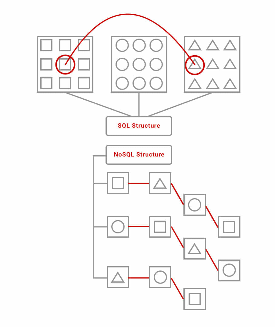
Both Realtime and Firestore are NoSQL databases, which come with their own pros and cons when compared to more traditional SQL databases. While SQL databases are organized to write data in a very efficient manner; NoSQL databases are organized to read data quickly, but due to their structure, require duplicate data in order to access information.

You can think of a SQL database as a collection of tables that hold very specific, uniform sets of information, that link up in a web. NoSQL databases are structured in branches, which lead to other branches, which lead to other branches.

NoSQL

Basically, when data needs to be shared instantaneously across hundreds, thousands, or even millions of devices, NoSQL databases are very efficient because of their data structure. Both Realtime Database and Cloud Firestore offer real-time and offline support with SDKs specifically built for mobile. Both are capable of being implemented for pretty much every real-time use case you can think of – from chat to re-sizing photos, to analytics and machine learning.

If you know your app will only be used by a relatively small audience in a localized area, and your data sets are straight-forward, go with Realtime Database. Cloud Firestore horizontally scalable – meaning it works better than Realtime Database when used across multiple localized areas, as you don’t need to create shards in order to do so. Because of Firestore’s structure, data is very easily split between different servers.

The Firebase payment model starts at a free version, and has two other plans: $25 a month, and a pay-as-you-go option.

Apps that utilize real-time

Sometimes, it’s a bit difficult to imagine what kinds of apps use real-time features in order to work properly, or improve their UX. So, here are some real-world examples of apps that use real-time tech:

Uber

Real-time tech is the backbone of Uber. Without it, users wouldn’t know where their driver was, driver’s wouldn’t know the location of their passengers, and GPS wouldn’t work.

SafeLite Auto

Much in the same way Uber relies on real-time updates to track its drivers, so to does Safelite’s app, which provides users with the location and ETA for a mobile technician.

WhatsApp

WhatsApp uses real-time updates for chat, voice, and video features. This is necessary for low-latency communication, and keeps conversations smooth, with even pacing, and no downtime.

Dominos

Real-time updates are how Dominos keep customers informed about the status of their pizza order – when it’s in the oven, when it’s ready for pick up, or when it’s out for delivery.

Inventory management

Inventory management at scale would be completely impossible without real-time updating capabilities. Keeping accurate track of your company’s stock requires knowing your exact inventory numbers every moment – when you’re working at a national or global scale, conversions can happen at rates that can only be tracked through real-time updates.

Your options for real-time

There’s plenty more services out there – but what’s important to know is that just like most software services, the costs of a real-time APIs increase with the scale of your app. If you’re going the native development route, your costs will largely rely on how much infrastructure investment is required, as well as your servers’ maintenance costs.

How much does it cost to implement login capabilities?

There’s a lot of apps that require a login feature – mostly out of necessity for the app to work properly – but data has shown giving users the ability to personalize their experience within your app is a powerful UX strategy when used to increase your user retention.

There is, however, one major downside to including the requirement that users set up a profile before they can fully utilize your app: app abandonment due to first impressions.

If users are met with a proverbial checklist of requirements to complete before they can actually use your app, they’re much more likely to give up before proceeding. This is where implementing a login through social feature comes into play – it gives your first-time users the ability to create a profile with one tap, rather than filling out forms and fields.

So, how much does this user-retention-saving feature cost?

Honestly, not too much – it all depends on how secure you want it to be. If you use our favorite app analytics platform, Kumulos, it can take anywhere from 1-3 hours to implement a login feature with an app, depending on the complexity.

Implementing a login feature with the lowest form of security (basic authentication) can cost as little as $100 to implement. Apps that want to utilize the highest levels of security can expect a cost of $10,000 for a login feature implementation.

When it comes to the cost of implementing logins with social media, such as Facebook, or Instagram, there is no extra cost – just the addition to the time it takes to actually implement. The price of these social login features comes from labor cost – the APIs themselves are free.

Let’s look into why adding these extra layers of security can cause such a drastic change in total cost, and, if the added security is worth it in the long run.

The costs of security

There’s many different forms of security when it comes to user authentication. The costs of which can vary depending on many different factors – ranging from time to develop to the cost of physical infrastructure.

There is something important to keep in mind in regards to the cost of security: the cost of code only changes if you are implementing third party APIs that come with a price tag or subscription fee – implementing your own code to allow for security that exists in a digital space only comes with different associated costs due to one factor: time to develop.

Let’s cover those:

Basic Authentication

The least complex login method is called basic authentication. Let’s go over how user authentication (at its most basic levels) works:

  1. A user enters their credentials
  2. Those credentials are sent to an authentication server
  3. The server will then attempt to match the credentials together
  4. Upon a match, the server authorizes the user’s attempted access

This process is faster than it sounds – it happens every time you login to a website that requires your username and password, such as your bank. This process is also referred to as “logon” authentication.

Single-Sign-On (SSO)

SSO functions very similarly to logon authentication, but rather than granting access to a single server, it grants access to multiple – a lot of social media and email websites will use this feature.

While SSO is the least secure method (as it gives access to multiple servers), it works well for apps for two reasons – smartphones are generally intimately used devices, so the chances of someone physically accessing your personal information via your smartphone is diminished; and, SSO does wonders for user retention, which is a hard-fought battle for most apps.

IPSec

IPSec is the most secure form of user authentication. IPSec allows data to be encrypted and authenticated over a secure internet protocol network. In order for the user’s device to understand, and then display the correct information based on the encrypted data, a method called mutual authentication is used.

This happens at the first instance of the user logging in, and continues to happen throughout the session as cryptographic keys are exchanged over the secure server. This can be implemented in three types of data transfer: user-to-user, network-to-network, and network-to-user.

Biometrics

Biometric security is largely implemented through physical means, and utilized in mainly on-site locations, rather than remote – therefore, its most common use case is in buildings that require high amounts of security.

Current biometric capabilities include finger print scanners, voice recognition, and retinal and face scanners. These capabilities are rapidly changing and expanding into different realms of biometrics, such as heartbeat and even brain activity.

Biometric security is a high cost investment, as it requires specialized scanning equipment – because of this, its costs can greatly exceed $10,000 – this number depends heavily on the scale and amount of scanning devices required.

Token Authentication

Token authentication requires a user to physically possess a device, such as a dongle, card, or RFID chip (plus a password) in order to access a secure system. While this is a highly robust method of security, due to the requirement of both an actual device and password needed to be used to access a server or system, it mainly only works for organizations that have the infrastructure necessary to implement an extensive system such as this.

Transaction Authentication

Transaction authentication is a pretty straightforward security method. In essence, it boils down to this: If a transaction (via credit card or payment service) seems suspicious, the person making the transaction will be prompted to take extra steps in order to verify that they are indeed the person they claim to be.

While the idea of asking someone “Are you sure you are who you say you are?” Is a simple security measure to wrap your head around, the systems required to make that process possible are intricate and costly – and require a significant amount of investment in infrastructure.

This is largely due to the fact that you must first have significant amounts of data for each customer profile before you can start defining suspicious account activity, and then flagging errant transactions.

Multi-factor Authentication (MFA)

Multi-factor authentication simply means mixing two types of user authentication together into a single authentication process. For instance, the example we used for biometric authentication (requiring bio-data and a password) can be classified as MFA, or, our example of token authentication – requiring a user possess both a device and password.

Out-of-band Authentication (OOB)

Out-of-band authentication validates login requests by requiring the user to provide information that can only be accessed by a device different from the one they are currently using to log on. For example:

When you login to your car insurance website, but before you do, you receive a text message containing an access code that is only valid for a limited amount of time. You then enter that code into the website, and you finish the login process.

This is a method of security that has a very applicable use case for an app that needs a high degree of security.

The costs of not using secure login authentication

First, it’s important to get one thing clear – if your app doesn’t make use of sensitive or highly personal information, go ahead with SSO. There are options you can take to implement extra layers of security on the initial login authentication.

If your app does make use of sensitive info, however, it’s vitally important to your user retention, brand equity, and business in general to use the highest levels of security. When comparing the cost of $10,000 to the cost a negative user review and rating can do to your app’s ranking, it’s definitely worth the upfront cost.

A perfect example of this is what happened to Facebook and its reputation after the Cambridge Analytica scandal; 1 in 10 American users deleted their actual profile, and 26% of American users deleted Facebook’s app from their devices.

Their brand is irreparably ruined in the eyes of some of its former customers – 15% of users who responded to a survey conducted by market intelligence firm Creative Strategies and Techpinions said there was nothing Facebook could do to regain their trust.

This was the response to a social media company’s mishandling of user data – now just imagine what the fallout would be if your sensitive-data-based app mishandled users’ personal information.

Context is key

When budgeting for a login feature with your mobile app, it all comes down to how secure your app needs to be. Basic user authentication can be implemented for as little as $100, and IPSec can reach the realm of $10,000.