Why we build apps like Wine Swap and Brew Trader

We were asked something recently that made me stop to smell the proverbial roses. The question itself was pretty simple – but the answer isn’t.

“Why do you make free apps using expenses from your own pocket? What do you stand to gain?”

It would be simple for us to reply with something along the lines of: “Easy – we make apps because we’re passionate about making them.”

But does that really answer the question? It’s an answer any company, selling any product, could respond with – and we’re not about being just like everyone else. Yes, passion does drive us to produce the best possible product every time, but there’s a lot more to the answer than “we wanted to.”

I mean, yeah – we did want to. Our founder and CEO, Nick Jones, came up with the idea for Brew Trader while looking at his craft beer selection at home; our Business Development Manager helmed the creation of Wine Swap – not only was it a logical next step after Brew Trader, he also really likes wine. He’s a level one sommelier, in fact.

So yes, we made these two apps because we like the subject matter. But we’re passionate about our clients’ apps as well – most of us here play some sort of sport, so Sportly was an absolute blast to work on. We live in Richmond, so we all understand the pain of parking in a city – which made creating iPermit a true joy. Knowing we were helping to take away the hassle of parking and permits out of peoples lives was, honestly, incredibly gratifying.

NS804 is a collection of people who all have different life experiences, come from different places, share different ideologies, and different interests. It’s this diversity of spirit that creates such a capable team – we all overlap in skillsets, while simultaneously all bringing something new to the table.

If you were to ask our Operations Manager what her dream vacation would be, you’d hear “Disney” before you could finish your sentence – if you were to ask me, it would be: “Camping somewhere far away from everything.”

What brings us all together isn’t even apps really (although, as stated previously, we’re truly passionate about making them). We’re problem solvers. And in the age we live in now, apps are the ultimate problem-solving tool. If it were the 17th century, we’d be watch makers, astronomers, adventurers. If it were 2000 BC, we’d be testing new materials for optimal wheel construction.

We’re drawn to problem-solving because when you solve a problem, you make something better. Bringing value into peoples lives is something that inspires us, gives us an easily-actionable reason to build apps.

The joy of knowing we made something easier for people out there in the world – even if it’s just a little easier – is worth the labor of creating an in-house app for absolutely zero profit. Negative profit, in fact.

That’s why we made Wine Swap and Brew Trader – to make finding your favorite beverages easier, and to help each other connect with people who care as much as we do about good beer and wine. It’s not the money, it’s not the drinks – it’s knowing we played a part in someone getting to do what they love, with other people that enjoy it just as much.

I’ve worked at a lot of different places, but I’ve never worked somewhere the CEO isn’t motivated by money – he’s motivated by helping others. If it sounds corny, drop on by sometime. You’ll find some of us diligently huddled over a keyboard, crafting lines of code, some of us playing fetch with our CBO, and a few others quietly designing beautiful UIs.

There’s a lot of different types of people here, but we all want to do one thing – make your dream a reality.

Convincing your manager to let you play D&D as a team building exercise: Project proposal

You reach the end of the hallway, the entrance to your boss’s office looming before you. As you extend your arm to knock on the heavy wooden door, you hear a voice reverberate from behind the closed threshold.

“Yup?”

Your hand turns the cold steel handle of the office door – your manager sits before you, leaning forward in their chair, studying the screen of their computer. Now is the moment you’ve been waiting for.

“Hey, um, I was wondering if we could play D&D as a team-building exercise.”

“Play D&D? No. When’s your code going to be ready for review?”

If you read our previous blog that goes into the theory of why D&D is the perfect team-building exercise, you might’ve had a similar conversation with your manager recently – and for that, we apologize.

Luckily, I have the best job in the world, so I get paid to come up with project proposals for D&D (well, just this once – but still). Not trying to sound braggadocios, it’s just when you work at NS804, you spend a lot more time smiling than frowning.

When our CBO makes the rounds every thirty minutes or so, it’s difficult to not keep a smile on your face – that, and our Thursdays are our Fridays, so our Fridays are our Saturdays, and we get this great day after Sunday I like to call I’m-actually-feeling-rejuvenated-day.

So anyway, here it is – your very own fill-in-the-blank D&D team-building exercise project proposal:

Executive Summary

Collaboration, cohesion, synergy, speed, unity – all qualities our ___________ Department / Team can achieve and improve upon in as little as two hours, and with virtually no spend – all by playing a session of Dungeons & Dragons. Below, you will find an outline of the information presented throughout this proposal:

  • D&D context
  • Player and game requirements
  • How D&D will improve our teamwork
  • Vision and goals for the session
  • Pre and post-session reporting
  • Session planning and implementation timeframe
  • Needed resources
  • Budget
  • Session ownership and responsibility hierarchy
  • Risk assessment
  • Session implications
  • Success criteria
  • Authorization steps

Our department / team has recently noticed we need to improve upon our ________ (communication / collaboration / criticism / deadlines / energy management / confidence / decision making) and in order to do so, we propose sending our team into the land of Codia.

This is a land fraught with many dangers and wonders alike – but tragedy has befallen the once pristine land of Codia. The once steadfast and robust Omnicron, the magical tome that brought order, law, and organization to the realm, has been torn asunder – its pages bereft of their bindings and scattered across the wilds.

Only the _________ Department / Team can deliver peace and unity to this once-proud land.

Our department / team must brave the wilds of Codia and the dangers that haunt them, journey to rediscover the pages of the Omnicron, defeat any who might stand in their way, and return the pages orderly, to their proper place. Once our ________ Department / Team has completed this dire quest, prosperity and unity will once again grace the land of Codia.

D&D Context

Sessions of Dungeons & Dragons have been promoting team-based skillsets since 1974, when Gary Gygax invented the game we now colloquially refer to as D&D. The game is classified as a pencil and paper tabletop role-playing game – it revolves around improvisational, collective storytelling, via acting out and imagining different scenarios that effect the players.

These stories can be followed to completion in one game, or over the course of many games. When a story takes place over many games, individual games are called sessions, and the entirety of the story is called the campaign. Campaigns are sometimes broken into story arcs if the scope of the campaign warrants it.

Player Requirements

There are two different player roles – those being the player characters, who together form what is known as the party, and the Dungeon Master (DM) who is responsible for narrating the world to the party – this consists of story-telling elements like the setting, supporting characters, antagonists, encounters, obstacles, and plot.

Players will create a single character through which they will experience the world that is presented to them by the DM. During the game, players embody their character, and should do their best to act using the mannerisms of, and in the interests of their chosen character.

The DM will both create the setting of the world and the denizens that populate it – and is responsible for telling the story to the party by acting out different characters, events, and encounters. The DM judges outcomes of events through dice rolls – mainly a d20. The lower the number, the lower the chance of success – the higher the number, the greater the chance of success. A “1” is always a critical and automatic failure, and likewise, a “20” is always a critical and automatic success.

How D&D will improve our teamwork

Unlike other team building exercises, D&D necessitates that everyone involved pretends to be someone else – making it much easier to self-reflect and be open to new ideas. It’s not them in the situation, it’s the character they’re pretending to be. It’s a game about working with what you have, rather than what you want – and how you can use what’s available to you in the moment, in order to solve the problem at hand.

It fosters the growth – and eventual mastery – of personal qualities and traits that make a great team player.

Visit Why D&D is the perfect team-building exercise for more information.

Vision and goals for the session

We envision our team-building session to bring about a noticeable increase in our department’s / team’s productivity and output. By taking on new team roles in our quest through the land of Codia, we will not only learn new skillsets under pressure, we will also practice our team’s task management and collaborative reasoning skills when faced with danger or adversity on our adventure.

We expect results to be both noticeable and quantifiable after one two-hour session of D&D – we also propose that the benefits brought on by a session of D&D can be compounded and mastered through repeated and regular sessions.

Pre and post-session reporting

We will provide you with both a report of Codia’s status before our session takes place, and a status update following completion of the session. Our preliminary report will give details as to locations of Omnicron pages, the dangers and obstacles that guard them, and the bios of the player characters themselves.

After the session has been completed, we will provide a report of the status of the three previously aforementioned details, those being: a) number of Omnicron pages recovered, b) number of encounters completed successfully, and c) status of player characters post session.

Session planning and implementation timeframe

We expect the planning stage of our proposed project to take no more than a total of ___ hours. We have come to this conclusion based on the following equation:

([1 hour] x [number of players] + [4 hours] = [total number of hours])

The reasoning behind this equation is as follows: 1 hour for each character created, and 2 hours of planning for every hour of gameplay. The gameplay planning is the responsibility of the DM.

The duration of the session is set to take no more than 2 hours. After, a post-session briefing will require a negligible amount of time.

Needed resources

  • Paper
  • Pencils
  • 2 sets of gaming dice

Budget

$10.

Session ownership and responsibility hierarchy

It is the responsibility of each party member to create their own character prior to the session taking place. Each player is required to collaborate with the DM during this process – characters must fit within the confines of the world the DM has created.

Our project manager, _____________, will take the role of DM. It will be _____________’s responsibility to create the following elements of the campaign:

  • Setting (Biome, geopolitical setting, type of civilization, objects and items that can be found, etc.)
  • Plot (different encounters, obstacles, and “hooks”)
  • Characters (characters the party will interact with in order to further the plot)
  • Enemies (stats, skills, and motivations)
  • The DM is to make sure no player is made aware of any detail of the story before the session takes place – this is to ensure every challenge is truly solved using improvisation. It is also the DM’s responsibility to never break immersion – if a player decides to take a route that has not been planned previously by the DM, the DM must cooperate.

    Players are free to make whatever choice they want to in regards to how they interact with the world presented to them – as long as their actions fit the motives of the character they are role-playing. It is the responsibility of the DM to work with these unexpected detours, and get the party back on track in an organic, unobtrusive manner.

    Risk assessment

    There is virtually no risk to this project – all normal office injuries do apply, such as: carpel tunnel, paper cuts, getting dust in your eye, etc.

    There is about as much monetary risk as a lunch out.

    Session Implications

    If this project is not accepted, not only will Codia fall into disarray and chaos, our ________ Department / Team stands to lose out on an excellent team-building opportunity with little to no risk. Due to the incredibly low risk of the project, even small increases to team efficiency will provide significant return based on the initial investment of time and capital.

    Success Criteria

    Success of this project will be measured by the following criteria:

    1. Increased rate of achieving deadlines
    2. Increased successful implementations
    3. Increased team cohesion and collaboration

    Authorization steps

    Y / N

eCommerce and ERP integration: Improving your B2B operations

Speed, efficiency, and long term goals – successful businesses in 2019 live by the pivot, and live for the future.

Integrating your ERP (enterprise resource planning) with your eCommerce is both a quick pivot, and a good investment for the longterm – and if your B2B operations lack this integration, now is the perfect time to do so.

Choosing the wrong ERP software, however, can spell doom for your company – many ERP platforms are insecure and pose a risk of data breaches. ERP software is meant to bring extra value to your customers, and increase efficiency in your daily inventory and account management – security breaches will have the direct opposite result.

Let’s get into why ERP is important, and what you need to know in order to effectively implement your own ERP integration with your eCommerce.

What it does, and why it matters

When you integrate your ERP with your eCommerce, you create a system that automatically coordinates your customer-facing storefronts with your backend inventory and accounting management systems.

This is important because it drastically increases the efficiency of your B2B operations – when an item is purchased by a customer through your eCommerce site or app, or even a physical store if you have one, your backend inventory will automatically update itself to reflect the change. At the same time, your accounting system will also update to show the transaction.

Integrating your ERP with your eCommerce creates a bi-directional flow of data – when your backend inventory management system is updated, your customer-facing digital stores will automatically in realtime update as well.

This bi-directional realtime exchange can keep track and manage your main types of data, including order, inventory, item, customer, and shipping and tracking data. For example, if you were to add a new item into the backend of your inventory, all of the information would automatically populate on your eCommerce site and/or app.

If you were to edit the description of an item in your backend to include a sale discount, the frontend would reflect that change automatically as well. As soon as a customer puts that item in their cart, your inventory management system will be made aware. As soon as that item is purchased by that customer, your accounting system will automatically note the transaction.

This saves you time that would be spent manually entering multiple sets of duplicate data – meaning you don’t have to spend as much money on menial tasks.

Integrating your ERP with your eCommerce also increases customer satisfaction and customer loyalty, which ultimately leads to larger or more frequent orders.

A great example of the value add integrating your ERP with your eCommerce brings to your customers is their ability to access their live account info 24/7 – data such as order history, invoices, realtime pricing, and realtime stock can easily be made available to them.

When your customers feel like they’re included in the inner-workings of your business, they’ll feel more in control – which increases their loyalty, satisfaction, and spending.

Even slight increases to efficiency can have lasting impact. Consider the 20 million gallons of fuel that were saved by UPS trucks not taking left turns on their delivery routes. Simple changes can have profound and lasting impact.

The investment required to integrate your ERP with your eCommerce will always be worth it in the long run – and according to Gary Vaynerchuk, CEO of Vaynermedia and Chairman of VaynerX, if your business isn’t thinking about the future, you’ve already lost.

With great efficiency comes great responsibility

When you integrate your ERP with your eCommerce, you’re essentially collecting your business’s most important data in one place – it’s accessible by individual systems, but the data is shared amongst them, and the transfer of data between them can be breached.

If this happens, it can dramatically decrease your customer loyalty – which is the direct opposite of what integrating your ERP with your eCommerce is supposed to achieve.

Due to the tempting nature of this proverbial digital honeypot of business and customer data, it’s less a question of if a cyberattack will happen, and more a question of when. A recent report by Symantec found that this is a problem for companies large and small – 43% of cyber attacks are now against small businesses.

Not only do these integrated hub systems present a tempting target for data thieves, they usually tend to be implemented through third-party software. These integration systems can leave your company open to many vulnerabilities, for a few reasons:

1 – Lack of updates

When you don’t own the software, you’re unable to change the codebase to keep up with new security risks. If your company uses third-party ERP integration software, your data is at the mercy of when your provider updates their security. Lack of updates can leave your systems wide open to data breaches.

2 – Poor configuration

If your ERP system isn’t set up correctly, you’ll run the risk of leaving cracks for hackers to exploit. These vulnerabilities can include open ports, access parameter credentials that are unlocked, or issues that come from vulnerabilities left in the system.

3 – Lack of access controls

If too many people have access to your system, or have the ability to access too much data in your system, you can run the risk of an account being compromised, which would then grant access to your entire system. Use the principle of least privilege wherever applicable.

4 – DOS attacks

If hackers find a vulnerability and gain access to your system, the can use DOS (denial-of-service) attacks to shut down your operations. When all of your operations run off one system, this can bring your business to a standstill.

Due to all of these risks, you’ll want to ensure the highest level of security possible. Custom software development will always be your best option for security because it is tailor-made to your system and specifications. Also, the code is your own, so whenever you need to update your system to defend against a new security risk, you can do so without waiting for another company.

If you’d like to learn more about integrating your ERP with your eCommerce and custom inventory solutions, visit our blog on the topic.

Efficiency and speed are the keys to success

By integrating your ERP with your eCommerce, you can reduce your time spent manually entering data, streamline your systems synchronization, enable auto-notifications for customers, manage price and product changes, and integrate multiple online and offline sales channels. All of this integration is scalable as well – giving your business the ability to not only increase its demand, but handle that increased demand as well.

How to develop a MVP app when competition already exists

Developing a MVP app is great for beating your competition to market – but what do you do if your competition already exists?

Competitive analysis is your answer – and a powerful tool for helping to create a successful MVP app. By conducting a review of your competition on the App Store or Google Play, you can simplify and streamline your app’s development. While it’s great for your app to offer a completely unique experience, the most important aspect of UX is the quality of the solution your app provides its users.

In this chapter of MVP development, we’re going to go over the steps you need to take in order to run a successful competitive analysis of your competitor’s app. If you want to learn more about MVP app development, check out these other blogs:

First there was Uber – then there was Lyft

We covered this a little bit in a recent blog about market research and pain points – and we’re going to use it again, because it’s the perfect example for showcasing just what is possible from competitive analysis.

When Uber was released in 2009, it rapidly brought change to a set-in-stone industry. Users piled on to Uber as the app went relatively unchallenged, bringing a complete shake up to the taxi industry – until three years later in 2012, when Lyft came onto the scene.

Uber basically invented the idea of ride-sharing. If someone had said “ride-share” in 2008, you’d think they were phrasing “car-pooling” weirdly – Uber was also one of the first major platforms to help set up the gig economy.

Uber was so successful because of the app’s UX – finding a ride went from being a stressful guessing game fraught with social challenges that could have any outcome, to an exact process that required minimal human interaction while an app handled the logistics – for the drivers and riders both.

Uber was unstoppable – news about its earnings, tech, and disruption to the taxi industry were inescapable headlines – and then along came Lyft.

While Uber did do many things right when it came to the app’s UX, there was one single step that Lyft did better. Did Lyft take extra time to design a better screen for a certain step in the ride booking process? Did they figure out a way to improve latency throughout the app through clever implementation of real-time updating?

No. They actually took a step out. Uber – when it first started – allowed users to select an available rider from a list. Lyft, on the other hand, automatically assigns a driver to a user who has requested a ride – while this might seem like a devaluation to the use experience that Lyft provides in comparison to Uber, it was actually a huge boost.

Users never cared about who was giving them the ride – they were using Uber for the ease of finding a ride, not a driver. Ride share drivers are notorious for lacking the intimate knowledge of city routes that professional taxi drivers have, anyway – if Uber’s users were actually worried about who was giving them the ride, they’d stick with a taxi.

It’s worth noting that in 2019, Uber is still a much larger company than Lyft, but that’s not to say Lyft is either small, or a failure – as of January 2018, Lyft had 23 million users, and a market share of 29-35% worth $2.2 billion after a compound growth rate of 223% between 2014 and 2017.

What was the reason Lyft was able to grow so rapidly, when there was already a ride share giant on the scene that effectively held 100% of the market? Competitive analysis.

Let’s go over the steps you need to take in order to effectively analyze your app’s competition:

1 – Android, or iOS?

If you’re developing a MVP app, you’re probably doing so for two main reasons – affordability, and speed. Even if your app looks and functions exactly the same, if you plan on releasing it on both Google Play and the App Store, your app will require two different code bases; therefore, you’ll be spending extra time and money on two separate development teams, two beta tests, two marketing and ASO campaigns, and two app review, approval, and publishing processes.

Basically, if you’re developing a MVP app, and you plan on publishing to both the App Store and Google play, your app isn’t really a MVP anymore. We recommend developing your MVP for iOS for many reasons – the main being that IOS users engage more with apps than their Android counterparts.

If your competition only exists on Android devices, you should ask yourself a few questions:

  1. Is your target market heavily skewed towards Android devices?
  2. Is your app based around a pain point only Android users face?
  3. What is better for your app – competing against another app on Google Play, or capitalizing on an untapped market on the App Store?

Obviously, if your target market prefers Android devices, or your app gives users tools to create their own widgets for the Android homescreen, your MVP app should be designed for Android devices, and publish to Google Play.

In almost all other cases of MVP app development, iOS is going to be the best platform for quick growth, and high rates of user retention and engagement – the lifeblood of a MVP app.

2 – Categorize your competition

After deciding on your app’s launch platform, you’ll want to head on over to the App Store, and begin searching using keywords that are related to your app so you can begin analyzing your competition.

There are three levels of competition your app will face:

  1. Primary – These are apps that are competing for the same target market, and provide solutions to the same pain point. Think Uber vs. Lyft.
  2. Secondary – These are apps that seek a different market than your own, but provide a very similar solution. Think Snapchat vs. Instagram.
  3. Tertiary – These are apps that tangentially come into contact with your app’s target market, or pain point. Think LinkedIn vs. Facebook.

Knowing who falls where in these categories will allow you to hone your competitive analysis research, strengthen your chances at developing a successful app – MVPs are all about efficiency of production, after all.

3 – Examine your competitor’s app

There are two aspects of an app to pay close attention to when analyzing your competition:

  1. Design
  2. UX

The design your competition uses can always stand to be refurbished – UI trends and user expectations are evolving constantly for many reasons – two big culprits being bigger screens, and better, faster tech. For app design ideas that will stand up to the tests of 2019, check out these blogs:

  1. Top app design practices – 2019
  2. Five mobile app design ideas

Make note of what looks good, what can be changed, and what should absolutely be updated. Don’t be afraid to come to a similar design solution – if it works, it works. Design is a language; design like Yoda talks, you shouldn’t.

The flow of an app is exceedingly important to the UX it provides. Any snag in the process will almost surely take away from the positive experiences of an app – too many snags, and users will immediately abandon it in favor of a competitor.

That’s where you come in – if there’s one step in the flow of your competitor’s app that creates a hang-up in the process, you can use that to your advantage – just like Lyft did.

4 – Identify your competitor’s ASO and market positioning

Take a close look at your competitor’s page on the App Store – make a note of what they include in their short and long App Store descriptions, the types of videos they show, the promotional text they use, and the keywords they are utilizing.

These pieces of information will give you insight into what your target market has come to expect. This will set the standard, and the expectations to exceed when marketing your app, and building out your ASO.

If, for example you were making an app similar to Brew Trader, you’d want to pay close attention to what keywords it is ranking for. You can do this without any special tools by searching as many terms as you can come up with that have something to do with “beer” and “trade.”

Here’s a great keyword analysis tool for Google Play: https://keywordtool.io/app-store

Also, take a look at how your competition engages their target audience through social media, and their main website – apps require a web presence just like any product. Many times, users are made aware of a new app through engagement on social media, and then search the App Store for the app.

5 – Pricing model

This step is pretty simple – does your competition use advertising through a free app to generate revenue? Is it subscription based, or a one-time-fee on download? Or, does it utilize in-app purchases to drive revenue, like many games do? These are pretty much the four pricing models available to every app on the App Store or Google Play.

You’ll want your app’s cost to be in the same range as your direct competition – and since you’re making a MVP app, you might even be able to charge a little less.

6 – User reviews and ratings

The best part about competition already existing is a lot of your market research is already done for you. All you have to do is go to your competitor’s page on the App Store or Google Play, and check out the reviews and ratings left by users – they’re basically free focus group sessions!

Pay attention to what users like, and what they don’t like – many times apps can be slow to change, as to accommodate user requests can mean completely re-structuring the backend of an app’s architecture, or the company might lack the funding to implement updates.

Include the features you see most requested – but always make sure your app’s feature set compliments the solution to its pain point. Developing a MVP app means creating something that provides a solution to a pain point with as little features as possible. For more advice on creating tight feature sets, check out our blog on the topic.

7 – Company diagnostic

While this isn’t necessary to the success of your app, it can give you insight into the future of your own company. Two easy researchable things to look out for:

  1. Are they hiring?
  2. Are they receiving any funding?

The figures you find can give you an idea of what to expect down the road – don’t be dissuaded if the company isn’t hiring or hasn’t received any funding recently – they might only need a small team, or don’t require any outside investment.

Most importantly – have fun

When you’re conducting your competitive analysis, you’ll want to make sure you’re in the mindset of a user. The best way to create a successful app is to create a fun experience – this is why gamification has become such a phenomena in app design.

The easiest way to get into the mindset of a user is to forget you’re conducting competitive analysis – use the app the same way a user would, and you’ll gain much more insight into the experience it provides.

How do I build my first app?

Are you getting ready to make your first app, but you aren’t sure where to begin? Well, don’t worry – we’ve gone ahead and made you your very own app development roadmap!

With a little bit of planning, some market research, and practicing the implementation of a few marketing fundamentals, you’ll be well on your way to launching a successful app. Unless you plan on actually coding the app yourself, your developer will be there to help you along your app creation journey.

If you want to teach yourself how to code an app, our Swift and Android development guides are a great place to start. If you’re planning on making a code-less app, here are three blogs that go over the reasons why we believe native app development will always be your best option when it comes to making an app:

Step 1: Your pain point

Ideation is the first step in your app’s development – just like any product. All apps are designed around solving a pain point – it’s why users engage with apps – Face App answers the important questions like “what will I look like when I’m old?,” Waze helps you dodge traffic, and Instagram makes every shot look like a pro took it.

Something important to note is that your app’s pain point doesn’t need to be unique – all games solve the same problem: boredom. Your app can even solve the problem using largely the same feature set as a competing app – it really only has to do one thing differently to make an impact on the App Store of Google Play.

If your app’s pain point is in line with another already existent app, download your competitor and use it a few times – research and pay attention to how the app interacts with its users, and take note of what could be changed. Next week, we’ll be going into a lot more detail on how to develop a MVP app when your competition already has a grip on the market, so stay on the look out!

If your app isn’t facing any competition, make sure to conduct as much market research as you can – it’s important to tailor your research to the purpose of your app, however. For a detailed guide on the methodology behind conducting market research for your app, check out our MVP development: Market research and pain points blog.

Step 2: Your design

When on the topic of apps, the word “design” can refer to a lot of different aspects of app development. The first part of an app that needs to be designed is your main user story. A user story can be thought of as the steps a user takes when interacting with your app.

User stories can look very different depending on the nature of your app. A workout tracker app will see lots of downtime in between periods of quick interactions from the user over the course of their workout – a gaming app will see continuous interaction for the duration of their session.

User stories are important because they give you a roadmap for how to design the UI (user interface) of your app. A lot of questions can be answered by determining your main user story – that being the most likely situation users will be in when engaging with your app.

So, if you’re making a workout app, you’d want to stick with bold, energetic colors, big buttons, and easy-to-read, quick messages. If you were making a game, while you’d most likely still work with bold colors, you’d want to include a wider range and variance of colors, your UI will be more complicated to facilitate your app’s gameplay mechanics, and messages can afford to be a little longer (not too much though – apps are about quick feedback and interaction).

Other things to keep in mind when designing your app’s UI: the most likely time of day (or night) users will be interacting with your app, where they’ll be (out and about, or sitting down), the mood they can be expected to be in, and whether or not they’ll have access to wifi (some features require a lot of data to be transferred between the user’s device and a server).

If you’d like more tips on designing an app, as well as ideas for designing an app that will keep up with users’ expectations in 2019, check out these two blogs:

After you’ve sketched out a few screens of your app, and have a little bit of an understanding of how users would interact with it, it’s time to find a developer. When searching for a developer, always start with Clutch or The Manifest, or other software development sites like DesignRush. Sites like these collect reviews of developers from past clients, and provide rankings based on their portfolio, ability to deliver, and other metrics.

This will help you narrow down your search. There’s a lot that goes in to finding and building a relationship with your developer. For more tips and info, check out our blogs on the topic:

From here, the developer you’ve partnered with will begin designing the finalized versions of your app’s frontend and backend. The frontend of your app is the UI, and is what users interact with – the backend is the logic of your app.

Backends provide the architecture that keeps your app functioning – this is where your app’s APIs (Application Programming Interface) will connect with your app’s code to provide extra functionality. An example of an API is Google Maps, or the “log in with Facebook” button some apps use – APIs can be thought of as building blocks that speed up the development of your app.

APIs are a handy tool because they (usually) do their task extremely well, and will add to the overall UX (user experience) of your app because of their robustness and expertise at what they do. You do need to be careful when selecting which APIs your app will utilize, however – there are security risks and ethical violations that can come from implementing a bad API.

The backend also encompasses the nodes in your app that connect to databases that are stored in servers – storing data in remote servers means your app takes up less storage space on your users’ devices, and it loads faster – all key factors in helping to grow and maintain your app’s user retention.

Before you settle on how your app will be designed, you need to decide which platform (iOS or Android) will be best for your app. For more information on choosing between iOS or Android, check out these blogs:

Step 3: ASO and launch

ASO – or App Store Optimization, is the process of building your app’s rank in the App Store or Google Play by strengthening these key metrics:

  • User Acquisition
  • User Retention
  • User Engagement
  • User Ratings
  • User Reviews
  • Keywords

After putting all of these metrics through a formula, your app will be ranked on the App Store and Google Play. Your app’s ranking is incredibly important – when users on the App Store or Google Play search the app store using the phrase “workout app,” the keywords you’ve selected, and the metrics created by your user data, will determine where on the list of workout apps your’s will show.

This is why keyword selection is a finely-tuned process – try to rank for keywords that are too competitive, and your app (when it’s starting out, at least) might not be able to handle the heat. Ignore popular searches and your app might miss out on a huge number of conversions. For more about ASO, check out our ASO: 101 blog.

After selecting your keywords, and collecting all the media your app will need for its page on the App Store, Google Play, or both, (that being your app’s icon, promotional text, screenshots, a promotional video), you’ll want to submit your app for review. Apple’s review process is much more stringent than Google’s, and both have one-time publication fees, and take 30% of each purchase. The App Store has a yearly fee for hosting your app as well.

Once your app is launched, you’ll want to use your standard marketing channels, and social media to get the word out there – while apps do rely heavily on ASO for growth, traditional marketing campaigns still have there place.

After launch, pay attention to user reviews and ratings, and make sure to hook your app up to an analytics service like Kumulos. These allow you to analyze detailed reports on user data, giving you the ability to find trouble spots so you can maximize your app’s user retention.

Finally, it’s time to start all over again – apps require frequent updates to stay competitive.

There’s no magic formula

Mobile app development isn’t much different from any type of software development – it can just seem daunting because it’s still relatively new. But with the right developer and idea, your app stands a good chance at being a success.

Improving your business development process with an internal business app

If you work in business development, sales, outreach – or any facet of business that deals with the exchange of goods or services for economic gain – you know the struggles of dealing with client expectations, leads going cold, client acquisition, and all the other challenges that come with the territory of selling – either emotional or job-wise.

We’re living in the age of user experience – clients expect your engagements to be even more personalized and targeted to their needs than the native ads they see on social media. In fact, 79% of your communication efforts will go ignored by clients if the messages don’t meet your clients’ standards of desired personalization.

We’re also living in the age of speed – not only do your communications need to be personalized, you need the ability to react to changing demands and needs, new challenges, and new opportunities – and sometimes, even quick reactions aren’t enough – predicting your clients’ needs is the only true way to stay on top of your game and reduce client churn, dead ends, and increase your numbers.

The most effective way to accomplish this is by integrating your business development process with an internal business app.

For more examples of how you can improve your company’s efficiency, culture, and processes, check out these blogs:

In this blog, we’re going to go over the different features and capabilities an internal business app can add to your business development practices.

Lead management

Introducing yourself is easy – it’s keeping track of who’s who after the fact that’s the difficult part. It’s already hard enough when meeting prospective clients in face-to-face networking events, let alone when dealing faceless customer profiles aggregated through your website’s analytics.

Keeping track of leads, both at scale and speed, is crucial to your company’s success in today’s market. With the mobile revolution and the burgeoning IoT, large corporations aren’t the only businesses with global reach – the interconnectedness of markets and systems means your client can be halfway around the world, or right down the street – your methods for selling to them will largely remain the same, but their expectations will vary.

Measuring data is key to predicting your clients’ needs. By utilizing an internal business app that can keep track of customer relationship analytics like how often you speak with your most billed client, pending orders, or previous support inquires made, you can more accurately predict their requests or questions.

With an internal business app, you can automate both your relationship analytics, and your mid funnel marketing processes; such as marketing and re-marketing campaigns that utilize email or text to keep your prospective clients engaged with your business.

Even for businesses with smaller budgets, who lack the ability to implement complex backend systems necessary for such automation, a small backend system that auto-imports client data to your business developers is achievable – when a client fills out their info on your website, the backend system can then add it to their customer profile in your database. Small increases in efficiency can provide a huge boost to your employee’s productivity.

When your sales team adds contact information to a customer profile from a lead they just created, the data all ends up in the same place. Not only does this make it impossible to lose or create duplicate pieces of client data, it means that if a sales representative is no longer with your company, the lead’s info stays within your database – not on your employee’s personal phone.

Client communications

A small business in Virginia is expected to communicate with a client in London in the same manner as a large corporation with a London-based office would.

Customer service means a lot more than being polite and knowing your client’s first name – it means being able to answer their questions before they ask them – using the same phrases and language someone from their corner of the world would. Before you can achieve this capability, however, you first need to develop and maintain a personal connection with your clients.

The easiest way to create a personal relationship with a client is to know their personal needs – this means past interactions, as well as possibilities for potential business they have expressed to you.

Every business knows customer satisfaction is the number one key to success, and failure to meet customers’ expectations will spell the doom of any company. Knowledge is power – and in this case, knowledgable employees means happy clients.

Customer service and a personalized experience are important – in 2016, out of customers that switched services, 64% reported their reason was because of lack of a good experience with the company that was serving them – not due to the cost of services provided.

With the help of an internal business app, you can make sure every interaction with every client is measured, strategic, personal, and under control – meaning there’s no surprises for either you or your client, and everyone is sure to be happy.

Referral mangagement

Everyone knows the power of a good referral. Other than reengaging with an existing customer, it’s the most cost effective method for driving sales.

It’s truly a small world – but without a data management system made possible by an internal business app, networking and business development can look like a vast, disconnected landscape.

Through the backend client data management system made possible by an internal business app, you can connect the dots to figure out who knows who. Maybe one of your best clients knows that lead your business developer just added into your system? As soon as the data points connect (which, with the implementation of real-time updating, can be near-instantaneous), your entire business development team will know.

Your employee out in the field can start a conversation with the new potential client about your company’s work with the existing client, or, you can get a head start on communicating the request for a referral from your best client.

Having the power to connect referrals with new leads both at speed and in the field is a great tool to increase your lead generation: customers acquired through referrals have a 37% higher retention rate.

With an internal business app, you can, of course, add these referrals to your lead’s contact information that is stored on their personal profile – so all the data you would ever need to know about a client is stored in the same place, and is accessible from anywhere.

Account Management

When was the meeting with David? No, the other David. You know – the one with the on-demand dog walking app?

An internal business app mitigates these wasted minutes. If an account representative schedules a call with David-the-dog-walker, your account manager will know as well, because all the information David and his business can be found in the same place – his client profile in your internal business app.

Assigning tasks, scheduling meetings, making sure follow-up emails are sent, and phone calls are placed is simple when it’s automated. You can even set up automatic notifications to make sure no task is left by the wayside, as a double layer of redundancy to ensure your clients’ satisfaction.

Strengthen your customer relationships

There’s no better system than an internal business app for keeping the ever-changing world of business development in check. By managing and analyzing client data, you can increase lead generation, and solidify existing customer relationships through your internal business app.

We hope you’ve found this blog informative! If you’re interested in learning about the cost of implementing the capabilities we discussed, check out our How much does it cost to implement backend CRM software? blog.

MVP development: Market research and pain points

Most companies and entrepreneurs conduct some form of market research before beginning the development of their app. The reasoning behind the methodology of this research is often flawed, however – and not geared toward seeking out the kernel of truth that promotes powerful product ideation.

If the answers you’re searching for don’t lead to the proper insights, your app’s user retention will suffer. Knowing which questions to ask comes from understanding the purpose of your market research – and that’s exactly what we’re about to cover.

Speed doesn’t mean rushed

Chances are, if you’re researching strategies on how to optimize the development of your app through the creation of a MVP, you value your time – MVPs are the quickest and most efficient way to market, after all.

Despite their reputation for speed to market, however, MVP apps require ample planning, careful thought, and plenty of foresight. The app marketplace is constantly evolving, growing, and competing against ever-increasing user expectations – it’s up to you and your app to keep up with these rising standards.

Tomorrow, the next Lyft could arise. The next Google could shake things up. The market, and the technology that coexists with it, rests for no one – and neither will your users.

That’s why we wrote this blog – to give you a detailed roadmap to the strategic and creative headspace that you need to occupy in order to ensure your MVPs development is smooth, and your launch successful.

If you want to read more about MVP app development, check out our other blogs on the topic:

Market research means understanding the problem, not a consumer profile

First things first – the beginning of every app comes from the discovery of a consumer pain point – whether that discovery is made through your own ideation, from being confronted with the pain point in your own life, or through explorative market research – a pain point is the foundation of your app. It’s the first step in the conception of virtually every tool, product, or invention throughout all of history, in fact.

Even the most basic of tools solve a pain point. Horses helped people get to their destination faster. Wheels helped them carry more. Written language helped them keep track of the goods they traded with each other.

Pain points are the reason people bothered to tame horses and engineer the wheel. If the world was only a few miles in diameter, the wheel probably never would have seen its day in the sun. Pain points are also the reason why products phase in and out, markets evolve, and consumer expectations grow – there’s always a better solution. It’s why we all know the name Henry Ford.

Sometimes, through solving a pain point, a tangential, unexpected discovery is made – Ford might have set out to make cars, but his true legacy was the assembly line.

What do these ancient-to-early-twentieth century inventions have to do with MVP app development? They were based around solving a pain point – not tempting a specific target audience. Ford’s cars were successful because they were affordable – and they were affordable because they were made at a speed that had never been seen.

In order to be successful in terms of development, budget, and marketability, your MVP app must have the singular focus of the wheel, and the status-quo shake-up-ing of Ford’s assembly line. Inventiveness of this sort doesn’t come from understanding the buyer profile of a target market – it comes from having a true understanding of the problem they face.

Now, the wheel and the assembly line are great examples because they were so groundbreaking in the change that they brought to the world. The digital landscape (and the app marketplace especially) exist in a much more subtle ecosystem, however.

This is due to the power that is afforded to app users over any other type of consumer – a dissatisfied user is perfectly capable of finding an alternate product through Google Play or the App Store in a matter of seconds, and downloading that new app within minutes.

User ratings and reviews give consumers even more power; not only do they give potential users the ability to form an opinion of your app before downloading it, they also play a role in determining your app’s ranking on the App Store or Google Play (along with other user-based metrics such as user retention and engagement).

This problem affects a full quarter of apps – 25% of users abandon apps after one session.

This is how Lyft was able to capitalize on Uber’s success; like Ford’s assembly line, Lyft sped up the process of finding a ride by removing a single step from Uber’s process – and in doing so, won over a significant chunk of Uber’s users.

In the early days of Uber, and before Lyft forced the app to change, users were given a list of available drivers to choose from – on a surface level, this makes sense, and even seems like another way to bring added value to the user experience.

No one really cares enough, however, to compare and contrast the qualities of potential drivers, – and to Uber’s users, this was an unnecessary step in the process of getting from point A to point B.

Uber understood that people didn’t want to have to wave down taxis. Lyft understood users didn’t care who drove them – they just wanted a ride, and they wanted it now.

Your MVP app doesn’t need to invent a wheel of its own, nor does it need to reinvent it – it just needs to do one thing better than everyone else. Lyft took out the driver selection step in their app’s process, and because of this, their users were able to find a ride faster. So, users abandoned Uber in favor of Lyft.

The only way to have both the knowledge and confidence to take away previously-perceived value from a product, and then compete based upon the lack of that missing feature, is through careful analysis and understanding of the problem consumers face – not their buying behaviors.

How do you gain such intimate insight into the pain point consumers are presented with? Don’t seek out the market – seek the problem.

Put yourself in the user’s shoes

In order to understand the problem, you need to first experience the problem. How you go about this largely depends on what the problem is; if the problem is a real life situation – let’s say finding craft beer enthusiasts to trade brews with – you need to try out all of the beer trading avenues available to you.

This would entail going through the process of finding and trading beer through facebook groups, subreddits, or other social media channels, as well as going to any local beer festivals, tasting events, and brewery events – if it has to do with beer, you need to be there. Immerse yourself in the culture of craft beer.

Don’t just search for what it’s like to not have a good beer trading system – become so invested in craft beer culture that you need a better beer trading system to satiate your hobby.

Once you’ve truly experienced the pain point you’re trying to solve with your MVP app, you can begin to figure out the best solution to the problem. This is how we came up with the idea for Brew Trader.

If there’s an app that you believe has the potential to be streamlined, or could be improved by the implementation of a different feature set or business model, do the same thing – but tweak it to the digital landscape of mobile app use.

Use the app you’re going to compete against in every situation imaginable – be it location, time or day, the mood you’re in, or the people you’re with. Analyze every step in the app’s process, and make a list or scatter plot of the flow of the app.

After you have identified the parts of the competing app’s UX that work, and those that don’t, create your own flowchart using your firsthand knowledge of the users’ experience.

If you’d like more info on competitor analysis when developing a MVP, don’t fret – our MVP development: Competitive analysis and feature sets blog will be coming out soon.

Find the pain point

The solution will follow.

Knowing the crux of the problem is key to understanding what will constitute a good user experience. A strategically implemented ASO campaign, strong social media presence, and good user reviews and ratings will serve to drive your app’s growth – not your market research. When it comes to app development, the true power of market research comes from understanding the pain point of your users – not their buyer’s profile.

If you’d like more information about creating your own ASO campaign, check out our How to build a mobile app: ASO 101 blog. In the future, we’ll cover all you need to know about building a user base with your MVP app, so stay on the look out!

How much does payroll software implementation cost?

There are certain expenses every business has to accept – and one of the largest contributors to those reoccurring, inescapable costs is payroll. The time it takes to manage your payroll process will always need to be accounted for in your budget, but the time (and the resulting costs of the time and resources) spent can be diminished through the help of payroll software.

When it comes to choosing a payroll software, there are a multitude of options to compare – but first, we’re going to cover the reasoning behind paying for payroll software.

It’s about time

The goal of payroll is to be done in as little time as possible – there’s no profit to be made from it. Any process that cannot lead to income generation should be practiced in the most efficient manner possible – unfortunately, HR administrators tasked with payroll can spend up to ten hours a week on payroll alone.

So, when weighing the two options of either paying for payroll software or continuing to do it yourself, there’s an easy question to ask that will provide the answer as to which is more cost effective:

Which costs more – a quarter of my employee’s salary, or the payment model of a payroll SaaS?

For fun, let’s say the employee in question makes $35,000 a year – divide that number by four, and you’re left with $8750 – if your payroll is processed in house, that’s your yearly expense – for an administrative task that can never lead to income generation.

Let’s take that number and compare it to the cost of some of the more popular payroll software, apps, and APIs.

Freeware

There’s plenty of payroll software out there for free – and for small businesses, these are a good option. While not as comprehensive as proprietary software, free payroll software can help you accomplish simple payroll administrative tasks like payroll and tax computation and submission, direct deposit, new hire reporting, and year-end tax information.

There is one area that freeware can’t compete, however – scalability. There’s also a lack of options for customizing the software to your company’s needs – in the case of free payroll software, what you see is what you get.

If you’d like to try out your options before settling on a software for your payroll needs, there are many freemium versions of software that allow you to try out their service before purchasing payroll software.

One such is Gusto, which also has a proprietary software version that is purchased through a subscription. Let’s go over the cost of a subscription model payroll software:

Monthly subscription

While there are much more well-known payroll softwares out there (like ADP Workforce and Quickbooks) we think it’s important to showcase an up-and-comer like Gusto for two reasons: small businesses understand the needs of other small businesses in a more intimate way than large corporations, and there’s plenty of information already other there about both ADP and Quickbooks.

Despite a less well-known reputation than payroll software household names like Quickbooks or ADP Workforce, Gusto can do a lot: manage payroll administration, HR, and benefits administration and compliance, as well as automatically computing your business’ local, state, and federal payroll taxes (including payment and submittal of payroll taxes), and the option of paying your employees through either direct deposit or check.

Its inviting look, and simple UI make it the perfect option for someone in a small to medium business who either doesn’t have formal training in HR operations, or needs to make more efficient use of their time in the office.

Gusto offers two subscription options – their Core Plan and Complete Plan.

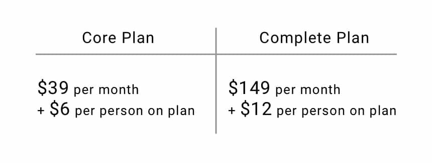
So, with a company of 10 employees, the Core Plan comes out to $1,118 per year, and the Complete Plan totals $3,228 per year. While still fairly priced given the automation and services Gusto provides, its costs can quickly increase as the scale of your company grows. On the Core Plan, a company with 100 employees would be charged $7,688 per year, and $16,188 on the Complete Plan.

Let’s continue looking at our options.

Per-user pricing

While this form of payroll software obviously suffers from the same issue as Gusto’s plan, they are definitely worth mentioning – for small businesses, per-user pricing payment models can be extremely cost effective.

PayrollHero offers employee attendance tracking, as well as scheduling, and time tracking and analytics – all available through a master platform that can be customized with product add-ons such as secure communication channels, data recovery, and unlimited storage. These add-ons do, of course, come with an additional price tag.

PayrollHero, like Gusto, has two payment options:

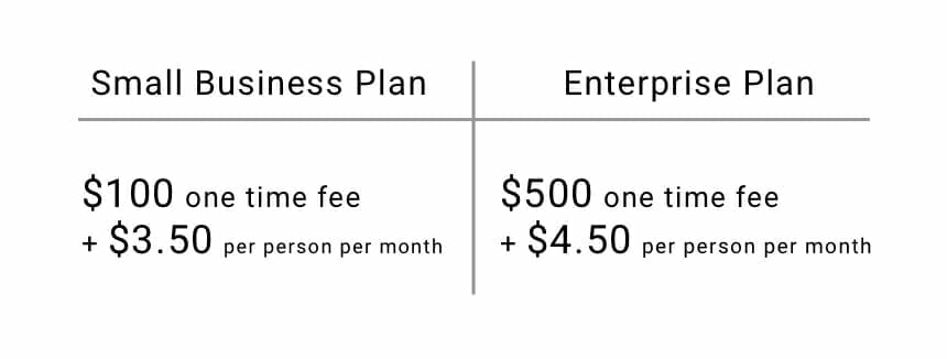
With 10 employees, the Small Business Plan comes to just $420 per year, and the Enterprise Plan comes to $540 per year. While these are extremely affordable options, PayrollHero doesn’t offer too much in the way of customizability or payroll tasks that aren’t directly related to employee attendance. For a small company that only needs a lean payroll system, however, PayrollHero is a good option.

Let’s look at a more customizable payroll platform and payment model:

Quote-based pricing

You can think of this option of payroll software as a pick-and-choose model. The perfect example of a quote-based payroll system (and one of the most widely-used payroll platforms out there) is Paychex.

Through the PayChex Flex platform, you can build your own payroll system out of pre-made sections of software – each option runs completely on its own, and they all seamlessly integrate with each other. These selectable options are as follows:

  • Payroll
  • Time & attendance
  • Retirement services
  • Recruiting and application tracking
  • HR records
  • Benefits administration
  • Hiring and on boarding
  • Reporting and analytics

Due to its customizable nature, it’s difficult to give a set price range for Paychex’s software – and prices can vary depending on the scale of your payroll operations.

Paychex is continuously improving their software through the Paychex API Developer Center.

Now that we’ve covered the different payment models of payroll software, let’s look into the costs behind the actual coding of the feature sets that make up a payroll system:

Custom payroll software development

If there are all of these great options, what’s the point in developing your own payroll software?

Lifetime value – yearly expenses add up after awhile. For example, let’s look back to our first payroll software example, Gusto. After 10 years, their Complete Plan will total $30,288 – and that’s if your company experiences zero growth over ten years.

Let’s pretend a company that started with 10 employees now has 100; at a rate of 100 employees, Gusto’s Complete Plan comes out to $16,188 per year. In just two years, that’s almost a much money as the yearly salary of a single employee.

A custom-made payroll platform has a much more cost effective lifetime value – there is only the upfront cost of development, and after your initial expense, the only extra associated costs come from maintenance or further additions to your custom platform.

Essentially a very complex backend system hooked up to different UIs, custom payroll software can cater to any business need – every feature listed in this blog can be implemented (and more): including commission management, and split payment management.

You can also integrate a custom-made payroll platform into your already existing internal business app.

Custom-made payroll software is undoubtably the most affordable option at scale – since the code is owned by your company, and not loaned by a third party, you can scale your custom-made payroll platform to any size of workforce and company infrastructure – and with mobile integration as well.

We’ve stated it many times throughout our blog – but it remains just as true; the cost of software development comes down to time, not type of software being developed. For a fairly complex custom-made payroll platform, designing and building the backend will take up the most time – this includes building out the logic, creating the backend architecture (how collections of data will communicate), and building out servers to store your payroll data.

Other costs include UI design, as well as the coding of the front end of your platform. All in all, an average estimate could range from $50,000 to $250,000 depending on your desired complexity. Those are big numbers – but keep in mind, they are truly one-time costs, and the product developed is fully scalable, at no extra cost (other than server maintenance).

Let’s compare those numbers to the expenses of a company with 1,000 employees using Gusto’s Complete Plan. After 10 years with 1,000 employees, Gusto’s costs come out to $121,490. If you’re planning ahead for your company’s future and growth, a custom-made payroll platform will end up being the most cost effective option.

Empower your HR team

When your company makes use of payroll software, your HR department has more time to do what they’re supposed to do – build and disseminate your company’s employee culture. Internal culture and employee happiness are directly related to productivity, speed of business, and employee longevity and loyalty.

When your HR team is working for your people, and not your money, your business can grow into a more efficient, productive, and happy workplace.

Top app design practices – 2019

Every year, mobile design evolves – and so far, 2019 has been big on embracing change. From foldable smartphones and rumors of those that even roll-up, to voice truly making an impact on the IoT.

There’s a lot to keep track of and look out for, with such a rapidly changing digital landscape and app marketplace. From 2015 and up until mid-2018, while devices were advancing, there weren’t too many drastic changes to processing speed and power, display clarity, or network speeds.

2019, has, so far, been the break in that static chain – and we’re only just in the second half of the year.

With faster data transfer speeds, sharper images, and a continued growth in our collective understanding of designing good UI (remember when we thought of UI as menus on a page?) for a medium that’s just now seeing people reach the 20 year mark, it’s imperative to keep up with such a trend-setting year for design.

We covered five mobile design ideas recently, but we wanted to go over even more – mobile app design is a large box to un-package.

Bottom Navigation

Think of how you hold your phone. Usually, it’s held in your dominant hand, using your thumb to scroll through and select content – it’s the overall preferred way we interact with our phones.

Since the beginning of mobile app design, there’s been a trend to position navigation bars at the top of the screen (not all apps, but a significant amount), and this makes sense – before the title “UX designer” came about, there were web designers.

What does a difference in title have to do with where a navigation bar ends up on a screen? Web designers were the first to design for mobile, and as such, brought the design hierarchy of the desktop to apps. When using a desktop, it’s natural for our eyes to gravitate toward the upper two thirds of the screen – and this is even more pronounced on a laptop.

Not to mention most desktop computers have their own navigation menu (usually) located on the bottom of the screen – the task bar for Windows, and the dock for MacOS.

So, when web designers began designing mobile apps, they put the navigation bar where they always had – at the top. And for a while, this wasn’t an issue; screen sizes on mobile devices were small enough that users could just adjust their hand to continue using their one dominant thumb to interact with their phone.

Screen size and resolution have grown dramatically in recent years, however – and it’s brought light to a needed change to the status-quo of mobile design – the practical necessity of bottom navigation.

Bottom navigation doesn’t just mean a permanent menu that lives at the bottom of an app’s screen – it also includes bringing most of the interactive UI elements of your app to the bottom.

Here’s an example:

Notice how content is relegated to the top two thirds of the screen, and interactive elements are located in the bottom third. Once something is selected that requires an extra step, the new menu should come up and in from the bottom of the screen from behind the main bottom navigation bar.

This keeps user’s thumb and hand positioned firmly towards the bottom of the screen – making interacting with your app faster, easier, and with a much better UX than with top navigation.

Deep flat

Flat design has reigned supreme for many years now – and all of its benefits are still present in its newest form – deep flat.

Deep flat is simply the idea of utilizing the same flat design elements we all know and love for their visual simplicity and coherence, with added perspective and motion for additional user clarity. It’s much easier to explain visually than through words:

Credit: https://dribbble.com/glebich

While deep flat can make use of gradients to give the idea of depth, it doesn’t have to:

Credit: https://dribbble.com/MarkusM

But, one quality all deep flat design shares is motion. Technically referred to as dynamic functional design, motion is now being used in apps at a much higher rate. But as we’ve stated before, you’ll want to make sure your app doesn’t move around too much – animations should be as satisfying for a user the first time they see it, and the thousandth time.

A general and easy rule to follow if you want to make sure your app’s animations never get annoying is to keep them shorter than half a second.

Deep flat is good practice to get a hold of now, for two reasons: first, apps that are graphic heavy tend to have higher user retention than those that are less so – and second, in a few years, dev shops will expect UI designers to have a solid grasp of deep flat implementation.

Gradient 2.0

Gradients are still used to portray depth on a screen – and until recently, gradients were only lived on screens as shadows – not any longer, however. Device displays have progressed to the point where colored gradients can be described as “vivid” rather than “muddy.”

It’s why all the new devices make sure to have a colored gradient serving as the background of the home screen – they’re showing off how vibrant their rendition of colors can be. Now, color gradients can be used in backgrounds, icons, logos, and all other forms of graphics that make up an app’s UI.

Getting used to implementing color gradients into your UI design now will give you a head start as users begin to ignore less colorful apps in favor of brighter (and therefore more eye-catching) apps.

Gradient 2.0 goes hand in hand with dark mode, which we’ve gone over previously.

Voice

Including voice integration with your app isn’t necessary in 2019 – but it soon will be if you want your user retention to remain stable. Voice AI is becoming more advanced with every passing minute, and soon users will come to appreciate and expect the UX benefits it brings.

Adding voice integration into your app’s UI isn’t very difficult – its functionality is easily indicated with a universal microphone symbol. Implementing this feature into your app’s code base is another story unto itself – a heavy and robust backend architecture is required to support the logic necessary for a voice feature to work properly.

On that note, it’s on to our last top design practice (for this blog, at least):

Learn to code

It isn’t easy – and you don’t have to know everything. But the more you know about the OS you’re designing for, the better of a designer you’ll be. Knowing what the OS you’re designing for is capable of is just as important as knowing how to translate an app’s process into a design users can understand.

If you’d like to learn about the structure of an app made for iOS using Swift, check out: iOS development and Swift code – What you need to know.

For Android, check out: Android development – What you need to know.

We hope you’ve found these ideas helpful, and if you’re looking forward to more app design practices, don’t worry – there’s more coming in the future!

Five mobile app design ideas

Imagine you’re driving down the highway. Ahead of you are two cars, both of the same make and model, traveling down the road side by side – they’re even the same paint color. Despite these shared qualities, they’re easily distinguishable from each other. Why?

The car on the right is ten years older than the car on the left.

Just as the style of cars seems to evolve every five to ten years, so too do popular app design styles and features – albeit in a much tighter timeframe – and app trends tend to expire and evolve every 5 to ten months.

Due to these rapidly changing mobile design styles, maintaining your app’s user retention basically comes down to playing a continuous game of catch-up; whether it’s with newly thought of updates of your own, or as a response to users expecting a newly invented feature or style.

And if only that was all there was to worry about.

There’s a continuous stream of new devices flooding the market – Apple’s iPhone has a regular release cycle, and there are more Android devices than anyone can keep track of. With these new devices come higher screen resolutions, faster processing power, and in general, the ability to do more.

When phones have features, users expect to be able to use those features while engaging with your app. People buy devices because of the functionality they offer – and due to the continual evolution of mobile device design trends as well. If your app doesn’t account for the new features, resolutions, and capabilities of new devices, your users will stop engaging with your app.

No matter what, you’re going to need to update the design of your app during its lifecycle – but coming up with ideas once, twice, or even three (or more) times a year can get tiring. That’s why we’ve decided to write this blog – to give you some jumping-off points when coming up with new design ideas while updating your app.

If you’re looking for ideas on how to design an app from the very beginning, the following blogs are more in-line with what you’re looking for:

1 – Night Mode

If your app doesn’t already have a night mode, it’s time to implement one. The main purpose of night mode is to reduce your user’s eye strain during, well, the night. There are many other tangential benefits to night mode as well, however:

  • Improved legibility
  • Reduced eye fatigue
  • Less screen flicker (this is a very limited-in-scope issue, but can be a huge detractor to your app’s user retention)
  • Less blue light
  • Saves on battery usage

Implementing night mode is a relatively straightforward process – it should begin with your designer, who will play with color combinations for the proposed night mode. It’s not exactly as simple as inverting the colors of your app:

Notice that not all the design elements were perfectly inverted – the background of the night mode isn’t pure black, while the background of the normal mode is pure white. The text of the normal mode is a dark blue – the text in night mode is a very light grey; meanwhile, the button to add another textbox barely changed.

After landing on your color choices, your developers can step in. All that’s left to do is to change the color values already written in the code of your app – a very simple and straightforward process.

There is one more design implementation you need to make in order to ensure the best night mode experience for your users, however; users need an on/off toggle switch they can tap to turn night mode on and off. This is easy for both designers and programmers to implement, so this extra UI improving design feature won’t take too much time to develop.

If your app is for iOS, the code is extremely simple to write. The Swift tag “UISwitch” will provide your app’s users with a ready to use on/off toggle switch – then, it’s just down to placing it in the designer’s desired space.

Perhaps one of the best places to place the on/off toggle switch is in the top right corner of your app – this way, when users engage with your app in a darkened location or time of day, they don’t have to squint at a bright screen in order to find your night mode switch.

You can also consider implementing an auto night mode that enables itself after a certain time of day – this way, users don’t have to worry about pressing an on/off toggle switch.

Night mode is a simple design change that shows your users you care about both their experience using your app, as well as their personal health – implementing is easy and fast, while the improvements to your app’s UX are significant. Due to these factors, night mode is definitely worth the time and money required to implement into your app.

Next, we’re on to…

2 – Bigger, responsive buttons

Much in the same way that website elements (like buttons or image links) became more interactive and graphical as technology advanced (allowing for faster transfer and reading of data), so too are app design elements becoming more visually-oriented as mobile devices (and the introduction of 5G) improve data loading times.

A logical implementation of this is through responsive buttons – just as the header image on this page will respond to you hovering over it, so to are apps beginning to implement this type of responsive design. If you’re an iOS user, the most recognizable implementation of this would be how app icons will shake when you’re in your home screen’s edit mode.

Below, you’ll find a few different options for responsive buttons:

  • Swipe-able buttons
  • Enlarge-on-contact buttons
  • Flippable buttons

Also, why do we recommend making your buttons bigger? Simple – screens are bigger now. Not only do bigger buttons help tie your app’s design together on a bigger screen, they’re also easier for users to tap. If you’re deciding between an intricate and beautiful design, or a simple, easy-to-use and understand design, always go with the latter.

An app that provides easy interaction will beat the beautifully designed app every time – users don’t download apps to marvel at their design (well, we do) – they use your app to help solve a pain point. If a button is easier to tap, you’re helping them solve their pain point faster.

3 – Dynamic functional animation

In the same vein as responsive buttons, you can improve the flow of the entirety of your app by adding dynamic functional animation to its design. The most well-known example of dynamic functional animation would probably be scrolling parallax – which is achievable to implement with newer versions of both iOS and Android.

For an example of scrolling parallax, click here.

Other examples include:

  • Highlighting currently interacted with areas
  • Auto-zoom content
  • Dynamic images
  • Dynamic functional animation is first and foremost subtle. Rather than standing out on its own, dynamic functional animation serves to strengthen the design of an app itself through animations that are logically and strategically implemented.

    Humans are hardwired to acknowledge and respond to movement – it’s what makes it so hard to maintain eye contact during a conversation when something’s moving in the background. Due to this quirk of human nature, design enhanced by animation will usually catch someone’s attention more than a static design.

    In short, dynamic functional animation ensures your users give your app more attention.

    Dynamic functional animation ensures your users feel like they’re interacting with an actual, tangible tool, rather than pixels on a device’s screen. Animations needn’t be hardware intensive, nor utilize 3D graphics – simple motions like a shake, or colors of elements fading as they scroll over the screen add that extra little bit of UX that helps to keep users engaged.

    Even adding a little jiggle when switching between tabs significantly enhances the UX of an app:

    Credit: Behance Gallery

    There are some limitations you should impose upon yourself when implementing dynamic functional design in your app:

    Make sure it’s easy to use

    Your app should first and foremost be easy to use – for the same reason explained above in our section about responsive buttons. It’s named functional design for a reason – its implementation has the purpose of enhancing your user’s experience, not detracting (or distracting) from it.

    Dynamic design should always be able to be described as “simple.”

    Make sure it’s purposeful

    Any animation should fit with the functionality it is enhancing. For example, an image tile in a gallery could flip to reveal the photo’s information on the “back” of the photo – this would fit perfectly, as it gives the impression that the images are 3D and have a physical back that information could be written on. A progress bar that flips as it fills up, unlike our photo gallery, doesn’t make sense – and would probably only serve as a distraction.

    Make sure it’s not annoying

    This is perhaps the most important factor to keep in check – dynamic functional animation can get out of hand very fast.

    Tight, quick animations are fine, and add to the UX of your app. A long, drawn out animation only serves to interrupt the flow of your app, and increase the time it takes users to solve their pain point.

    Keep your animations short, and your users will stay happy. It might be fun to design and code highly detailed animations – your users might even appreciate the animation the first few times. But the purpose behind updating the design of your app is to increase your user retention – and if users are continually using your app, drawn out animations will quickly become stale.

    Make animations that are just as satisfying the thousandth time as the first.

    4 – Simplified UI

    While we’re on the topic of keeping things short and sweet, let’s take a look at the benefits of simplifying your app’s UI.

    We touched on this briefly in the first section of this blog already, but its’ importance warrants a more detailed overview. A simple UI will always be better than a complicated one – no matter how much extra functionality a complicated app’s UI provides its users, the simpler competitor with half the functionality will most likely be more popular.

    This is due to the same reason there’s such thing as a universal remote. There’s nothing more annoying than having to use three different remotes to watch a show on your TV. We tend to get frustrated as we’re presented with barriers such as these; in this example, we want to watch TV. Not play with remotes. For every extra remote we need to use, it’s an extra barrier to watching our show.

    The same goes for apps. For every step a user must take to complete a session in your app, another barrier has essentially been added between where the user is in their session, and the solution to your app’s pain point.

    Designing an app is like creating a sculpture made of marble – it’s a subtractive, rather than additive process. During the ideation stage of any app, it’s important to narrow the scope of your app to its core functionalities – from there, you can add extra features. But remember – for each feature added that’s necessary in the process of using your app, you are creating another barrier between your users and the solution to their pain point.

    Don’t make them use three remotes to finish a session in your app.

    Just as it’s wise to narrow down the scope of an app during its initial ideation, so too is it important to do the same when updating your app. An easy way to ensure practical application of simple UI updates is to treat updating your app as if the update is a MVP.

    The easiest method of implementing simple design updates is to create a list with everything you want your update to include, and then try to connect every bullet on that list to the main pain point of your app. If an item on your app’s update wishlist doesn’t help to solve the pain point, or improve the experience of using your app, it most likely isn’t needed.

    There is something we want to clarify – a simple and concise UI doesn’t always mean simple code, nor quick design. Dynamic functional animation will not be simple to program, just as a simple-to-understand design could take hundreds of hours to achieve.

    A simple implementation of dynamic functional animation is measured by how much (or lack of) interruption it provides in the process of using your app – the more interruption or delay in the flow, the less simple (for the user) it would be.

    5 – Color Palettes

    Circling back to the same vein as night mode, switching up your app’s palette can go a long way toward improving your app’s user retention.

    Picking new color schemes is fun, and the actual implementation of such is fairly easy (and we already covered it in the night mode section of this blog) – but we do want to cover the timing and methods behind putting a fresh coat of paint on your app.

    A/B testing

    A/B testing is switching out one piece of content with another, and then recording the results. In this case, rather than switching out actual content, you’d switch, for example, the color of your header text from blue to red, and then watch and record how your users react.

    In order to successfully run an A/B test, you’ll need to record all of your user data prior to the test for the same duration that the test will run. Then, implement the changes to your app through an update. Record the data that follows, and then compare the two sets of data. If you want to be extra through, you can repeat this process multiple times to ensure your samples aren’t skewed.

    From here, you can permanently implement the color palette that is best for your app’s user retention.

    Situational updates

    When it comes to updates, timing is everything. In order to capitalize on upcoming cultural events or holidays your users celebrate or engage in, you can update your app’s color palette for the duration of that time period.

    For example, a shopping app could update its color scheme to match the next upcoming holiday – changes like these can help put people in the holiday shopping mood. Now, keep in mind that this doesn’t mean this shopping app would change its normal color palette of white, blue, and orange to green, red, and white for Christmas. Rather, small hints of Christmas colors could be interspersed throughout the app.

    There’s an infinite number of app design ideas…

    But that’s all we have for now. We hope you’ve found this blog helpful in serving as a jumping-off point for your app’s new design.

    If you’d like to keep reading about app design, check out our blog on how design impacts the cost of your app.

    We’ll blog about more app design ideas in the future, so stay tuned for more!