
How much does it cost to update an app?
“An app is never finished.”
This quote is un-attributable because almost every app developer has said it – it’s a constant in the world of programming – software isn’t complete until it’s dead. From websites to operating systems, updates are an inescapable necessity.
In fact, it’s safe to assume you’ll spend one-fifth of your total development cost every year updating your app – so if your app cost $50,000 to develop, you can expect to spend about $10,000 a year on updates.
That might sound like a lot of money – and it is. If you want your app to be a top performer in terms of user retention, conversions, and revenue, however, you’ll need to be prepared to absorb the costs associated with updating your app. Based on this graph from SensorTower, you can see the industry average back in 2014 was to update an app well over once a month:
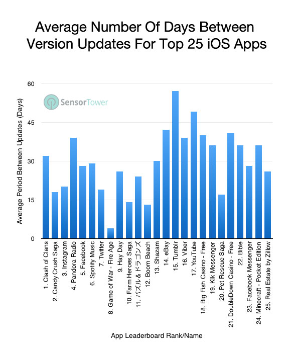
This is a correlation that has only grown in recent years – the most successful apps today release an update one to four times every month.
Why do apps update so frequently? There are a few different answers:
Updates are a form of marketing
Updates are among your strongest marketing tools – right up there with push notifications and proximity marketing. Updates are so powerful because they convey a few messages simultaneously:
- Serve as a reminder that your app exists
- Inform your users about value added to the app
- Provide a free CTA with immediate value for the user
Updates will also create a notification tag on their settings icon – both Android and iOS operating systems are designed to make users aware of their available updates, so users are sure to be made aware of the added value you are giving them.
Finding the right voice and message through push notifications can be incredibly difficult, but updates can be plain and straightforward – they inherently come with free value for the customer.
SCHEDULE A CONSULTATION WITH AN APP DEVELOPMENT EXPERT TO GET A CUSTOMIZED QUOTE!
Design and device trends
Keeping up with UI trends is a constant task of not only keeping your sights on what your competitors are doing, but also what the top twenty apps on the App Store or Google Play are doing as well.
This is because the competition in your category might not be staying up to date with their design choices as well – it’s always best to seek out the top performers and study what they’re doing. Keep a close eye on design aspects like:
- Where buttons are located on the screen
- Use of negative space
- Transitions
- How information is displayed
Design trends are always changing, and users are more likely to abandon an app than they are to stick by its side – if there’s an app out there that does what you do, but looks better, you’ll begin to lose users to it.
For more about keeping up with design trends, check out:
The same goes for device trends – mainly concerning higher screen resolutions. For every new screen size that hits the market, you’ll need to update your app in order to fit on those new devices. Keeping up with these trends is important to the health of your app – early adopters of new device models are usually power users, so if you aren’t catering to their needs, your app’s metrics will begin to drop substantially.
Security
Unfortunately, there will always be someone who is trying to exploit vulnerabilities in your app’s code – especially if your app deals with sensitive user data like payments or personal information. Luckily, updates can help mitigate these risks.
There is no way to build an un-crackable app. No matter what, someone out there will find a way to exploit a previously-unnoticed vulnerability if given enough time. An oft-sought out type of app for hackers to exploit are those that work in eCommerce – so if your app exists in this domain, make sure you are updating your security regularly.
Users take security very seriously. Take, for example, the fallout from Facebook’s Cambridge Analytica scandal: One in ten American users completely deleted their Facebook profile, and a staggering 26% deleted the mobile app from their smartphone.
When payment information is stolen, the response is even stronger. For this reason especially, eCommerce apps must be vigilant when it comes to the security of their users.
Bug Fixing
While the goal of any app is to launch without any bugs, they do sometimes happen. There’s many reasons for this – some bugs appear through situations that would be nearly impossible to test for, such as scalability issues, or new devices coming to market that don’t properly mesh with the code that makes your app run.
It’s a virtual guarantee that eventually, your app will run into a bug – what happens next is up to you. Users are fickle, and will abandon your app if they continue to run into bugs. In order to keep your users, you’ll need to fix the bug as quickly as possible.
New Features
Along with new device and design trends come new features – two big ones right now being location services and real-time updating. A good example is the order tracker popularized by Dominos Pizza. Dominos’ customers became familiar with their order tracker, and then began to expect it on other online ordering platforms.
Now, online food delivery platforms all make use of this order tracker – if they didn’t utilize it, users would abandon their app in favor of one that does. New features mean added value – always plan to add more value.
USE OUR APP COST CALCULATOR TO ESTIMATE THE COST TO BUILD YOUR APP!
Show your users you care
What looks better – a website with a regularly updated blog and content, or an obviously three-year-old website that’s still touting an award from 2016? When shown the latter, you’ll probably begin to question if the company is still in operation.
Users want to know the app they are investing their time into is there for the long haul – by updating your app regularly, you implicitly show them that your app is here to stay. It also shows that your app is worth looking at and using – if you care enough to update it, there must surely be value that makes the update worth it.
Updates are a powerful user retention tool – despite their cost, app updates are necessary to your app’s longevity, and publishers stand to loose more by not updating their app than by spending capital in order to do so.